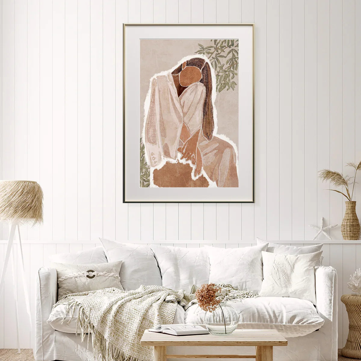
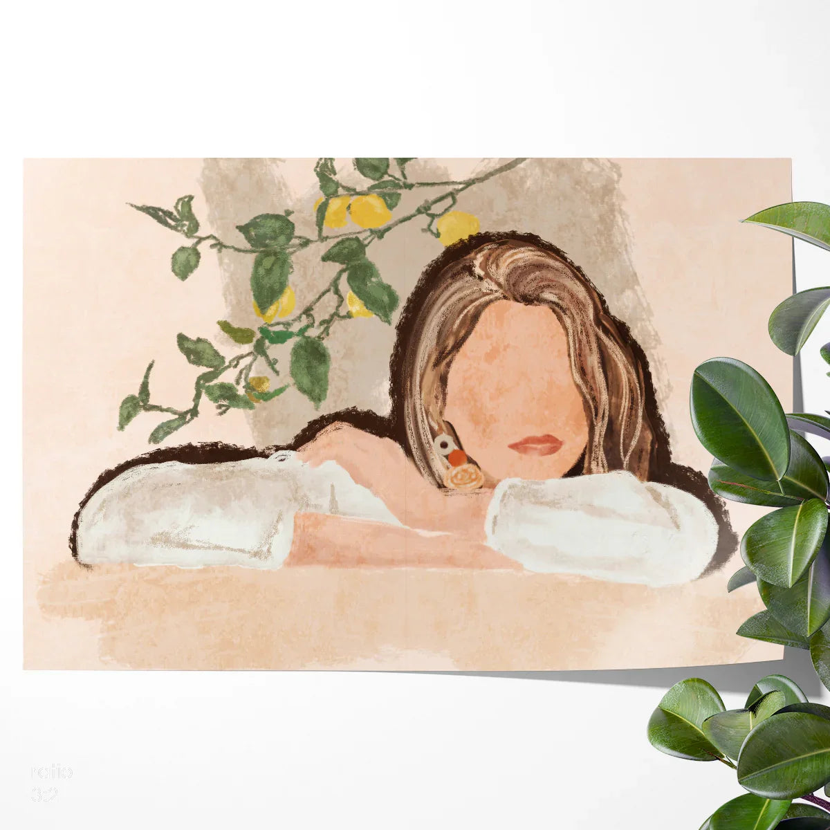
Abstract Pastel Woman — Boho Portrait Poster for Serene, Modern Spaces

When you want your space to feel grounded, warm and quietly confident, this abstract pastel boho portrait delivers. Its sun-warmed palette and minimalist facial contours invite calm while the soft texture reads like plaster and pigment—perfect for modern, Scandinavian, Japandi and coastal-boho rooms.
Printed on museum-quality, acid-free paper with allergy-safe HP Latex inks for long-lasting color and low-odor performance. Frames are shown for styling context and are not included.
Why this boho portrait resonates right now
Across contemporary interiors, the pendulum has swung toward natural materials, tactile finishes and softly desaturated color. Busy walls are out; restorative, edited rooms are in. This poster channels that shift with an abstract portrait rendered in sand, clay and almond tones—earthy but modern. The profile is simplified enough to complement geometric furniture and linear architecture, yet expressive enough to feel personal.
Designers often reach for a single, quietly striking piece to anchor an entryway or living room. Here, the visual weight lands in the center, framed by negative space that lets the room breathe. The result: a focal point that whispers rather than shouts. Place it above a linen sofa, a rattan bench, or a console in bleached oak; it instantly pulls your materials story together and subtly warms cooler, white-painted walls.
Beyond aesthetics, art like this solves real-world needs: it creates a finished look without the commitment of built-ins, softens acoustic echo on hard surfaces, and introduces a hint of organic movement in boxy spaces. If your home leans neutral or minimalist but feels “too clean,” this print is the nudge of soul it’s missing.


Materials, print quality, and what makes it special
Great wall art begins with paper and ink. This poster is printed on acid-free, museum-quality stock that resists yellowing and waviness over time. The paper’s weight lends a premium feel—substantial in hand, crisp in a frame—and preserves the nuanced mid-tones that make boho palettes so soothing. HP Latex inks provide rich color, low odor and allergy-conscious performance; they’re also known for excellent fade resistance under typical home lighting when framed behind UV-protective glazing.
Color work is where this design shines. Muted sandstone is offset with hints of cocoa and olive branch accents, meaning it harmonizes with beige, greige and even cool gray walls. The face is intentionally abstracted, which increases versatility: you get the warmth and humanity of a portrait without a strong gaze that can dominate a small space. Edges are softly feathered to avoid harsh contrast lines that might fight with shiplap or beadboard walls.
Value matters. Compared with commodity posters, this print offers better paper, safer inks and more carefully curated styling images to help you visualize the result at home. Against luxury alternatives, it competes on look and longevity while keeping the price accessible—especially in standard sizes that drop into off-the-shelf frames.
Who will love this poster (and how they’ll use it)
1) The Calm-Seeker
You’ve pared back clutter and crave a peaceful anchor for your living room. Your brief: “soft, organic, not another landscape.” This portrait lands the mood—warm neutrals, gentle movement, zero visual noise. You’ll pair it with boucle or a linen slipcovered sofa and a jute rug.
2) The First-Apartment Stylist
Budget-aware yet design-savvy, you want statement art that won’t lock you into a single look. In an 11×14 or 16×20 frame, this piece scales well to small rooms; later, upgrade to 24×36 when you move. The abstract face avoids the “too personal” vibe for shared spaces.
3) The Natural-Materials Enthusiast
Your palette is clay, oat, flax and olive. You mix oak with cane, limewash with plaster. This art reinforces your organic scheme without skewing rustic—it’s modern boho, not farmhouse. Hang it above a travertine console and let the tones echo.
4) The Home-Office Minimalist
You need focus but hate sterile walls. A vertical 18×24 centered over a credenza adds presence on camera for video calls and keeps your background cohesive with a neutral wardrobe.
5) The Gift-Giver
For housewarmings and birthdays, portraits can feel more thoughtful than generic abstracts. Choose A3 for easy European framing or 16×20 for US frames. Include a note about the calming palette and why you picked it for them.
6) The Gallery-Wall Curator
Combine this print with minimalist line drawings and small botanical studies. Use odd numbers (3 or 5) and vary frame widths. This portrait becomes the soft-spoken center that ties brighter accents together.
7) The Rental Refresh Pro
Art is your impact move when paint isn’t allowed. Choose adhesive hooks with weight rating, add a linen mat, and you’ve got boutique-hotel polish in 15 minutes.
“Art should comfort the disturbed and disturb the comfortable.” — Cesar A. Cruz. In serene spaces, this print does the first beautifully.
Thoughtful gifting, from housewarmings to holidays
Major life events
Weddings & new homes: Neutral art is the safest bet when you don’t know wall colors. A 24×36 anchors a first living room; include a note suggesting natural wood or matte-black frames. New baby arrivals: Choose 12×16 to float above a dresser with soft lamplight; the calming palette is nursery-friendly without clichés. Graduations & relocations: Opt for A2 for easy matting in EU frames and include removable hanging hardware.
Personal milestones
Birthdays & anniversaries: Pair the print with a hand-written message about creating a sanctuary corner at home. Career promotions: For offices, 18×24 fits above a credenza without stealing focus. Encouragement or recovery: The gentle expression and palette read restorative—frame lightly in oak for warmth.
Relationship-specific ideas
Parents & siblings: Mid-sizes (16×20, 18×24) are easiest to place. Partners: Go larger (24×36 or 30×40) to make a shared living room feel finished. Clients & mentors: Stick to minimal framing; include a gift receipt for simple exchanges.
Seasonal & cultural moments
Winter holidays: Order early and choose standard sizes for easy last-minute framing. Spring refresh: Place above an entry console with tulips and a ribbed glass vase. Summer gatherings: Style with raffia textures and citrus accents (lemon branches echo the palette). Autumn nesting: Add a nubby throw and terracotta vessels to deepen the warmth.
Corporate gifting
For office warmings or client programs, art with neutral colorways is universally palatable. Include a short card about the environmentally considerate ink set and acid-free paper. If timing is tight, ship directly to the recipient with a note and frame suggestions.
When to buy for best impact
Art buying follows rhythms: spring refresh, pre-summer hosting, autumn nesting, and early holiday planning. This poster thrives in all four. Its airy neutrals feel crisp in spring, play beautifully with natural textures in summer, co-sip pumpkin tones in fall, and add calm to winter hygge scenes. Off-season buys can also mean better availability in large sizes—and more time to source the perfect frame.
For promotion windows like Black Friday/Cyber Monday, consider sizing up: larger formats maximize savings and instantly resolve an unfinished living room wall. In January, focus on home-office backdrops that signal polish on video calls. Year-round utility is the real headline here: you won’t tire of this palette.
Room-by-room styling and placement tips
Living room: Center a 24×36 above a 72–84″ sofa, leaving 6–9″ between frame and back cushion. Pair with a boucle throw, ribbed ceramic lamp and a jute or sisal rug.
Bedroom: Over a low dresser (48–60″ wide), choose 18×24 or 24×32. Add linen bedding in stone or oat, and a small vase with olive branches for cohesion.
Entryway: A 16×20 over a 36–48″ console gives a boutique-hotel welcome. Ground it with a round tray, a key bowl and a small table lamp.
Home office: If you’re on camera, keep glare low with matte glazing. Place at shoulder height behind you; 18×24 reads crisp on most webcams.
Dining nook: Use 30×40 with a narrow black frame for contrast against light plaster or limewash paint; add linen runners and stoneware to echo texture.
Quick calculator: match poster size to your furniture width
Specifications and options
- Paper: Acid-free, museum-quality white stock designed to resist yellowing and waviness.
- Ink: Allergy-conscious HP Latex inks with strong fade resistance under typical home lighting.
- Orientation: Vertical portrait.
- Common sizes: 8×10, 11×14, 12×16, 12×18, 16×20, 16×24, 18×24, 20×30, 24×32, 24×36, 30×40, 32×48, 36×54, plus A-series (A4–A1) for easy EU framing.
- Framing: Ships rolled; frames not included. Pairs well with natural oak, thin matte-black metal or white gallery frames.
- Best wall colors: Warm whites, stone, oat, mushroom, greige; also soft green-grays.
| Room type | Furniture width | Suggested size | Why it works |
|---|---|---|---|
| Living room sofa (72–84″) | 180–213 cm | 24×36 or 30×40 | Proportional focal point with generous negative space. |
| Entry console (36–48″) | 90–122 cm | 16×20 or 18×24 | Keeps sightlines open while defining the vignette. |
| Low dresser (48–60″) | 122–152 cm | 18×24 or 24×32 | Balances lamps and mirrors; easy to center. |
| Home office backdrop | — | 18×24 | Reads clean on camera without glare when matted. |


Care, maintenance, and longevity
Handle posters by the edges with clean, dry hands. If framing yourself, work on a soft cloth and use acid-free backing and mat boards. Display out of direct sunlight or use UV-filter glazing to maximize color life. Dust frames with a soft, dry microfiber cloth; avoid ammonia cleaners on glazing. Stored prints should live in a cool, dry place, flat or in an archival tube with end caps. Expect multi-year vibrancy in typical home lighting; signs of normal aging include slight paper curl when unframed and micro-scuffs that vanish once behind glazing.
Warranty and returns follow CetArt’s shop policies; if shipping damage occurs, document immediately so we can make it right.
How this poster compares
Vs. budget posters: Heavier, acid-free paper and allergy-conscious inks mean better feel and durability. Styling imagery helps you visualize confidently.
Vs. luxury gallery prints: Similar aesthetic effect for a fraction of the cost. Standard sizes drop into ready-made frames—no custom lead times required.
Vs. loud color abstracts: This piece brings warmth without visual clutter, ideal for homes that value calm and cohesion.
Frequently asked questions
Will the colors match my walls?
The palette is intentionally neutral—almond, clay and soft olive accents. On bright white walls it adds warmth; on greige or plaster finishes it blends seamlessly. If you’re unsure, order a mid-size and test in different light before committing to oversize.
Is a frame included?
No—your poster ships rolled in a protective tube, so you can choose a frame that suits your decor and budget. Thin matte-black, natural oak and white gallery frames are top matches.
What sizes are available?
Standard US sizes from 8×10 up to 36×54, plus A-series (A4 to A1) for easy European framing. Use the calculator above to match size to your furniture width.
How should I mount or hang it?
For the cleanest look, frame with a mat and wire-hang so the artwork sits ~60″ from floor to center. In rentals, use high-rated adhesive hooks and ensure frame weight is within spec.
Can I create a set?
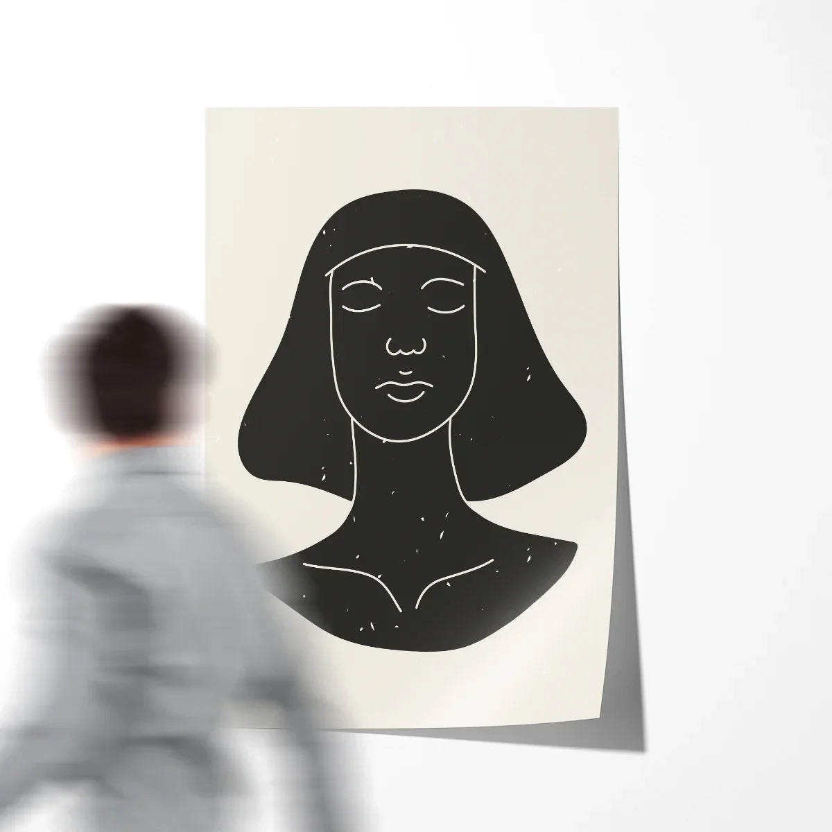
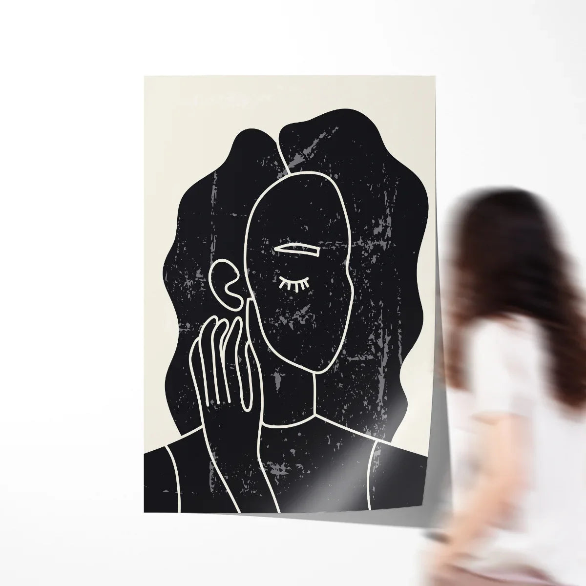
Yes—pair with minimalist line drawings or botanical prints. See “Related Posters” below for ready-to-match options in similar palettes.
How do I keep it from fading?
Display out of direct sunlight, or use UV-filter glazing. The paper is acid-free and the inks are engineered for indoor longevity when framed.
What if I need a different size?
Standard sizes cover most rooms; for special projects, contact us about non-standard options and timelines.
Is it suitable for commercial spaces?
Absolutely. The calm palette works in salons, cafes and waiting areas. Choose 24×36 or 30×40 to read clearly at a distance.
Bring calm, warmth and polish to your space
Few pieces pull a room together as effortlessly as a neutral abstract portrait. This one adds quiet character and texture without stealing the spotlight. Whether you’re finishing a first apartment or refining a long-loved home, the Abstract Pastel Woman poster is a reliable, timeless upgrade.
Related posters to complete the look
Pro tip: if your walls are cool white, add one warm material (oak frame, travertine tray or a sand-tone throw) within the same vignette to help this artwork feel integrated.