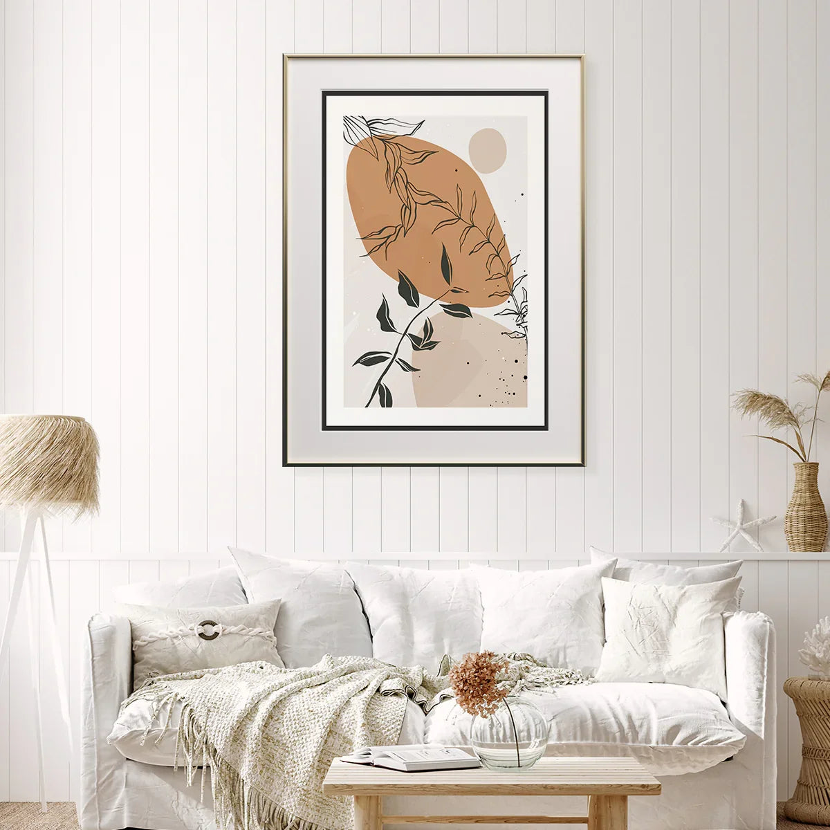
Abstract Plant Poster for Living Rooms: Modern Botanical Wall Art That Calms, Centers & Complements
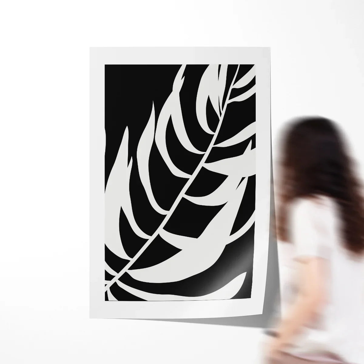
Organic linework, a warm sun-baked beige, and soot-soft charcoal leaves—this abstract plant poster is designed to live beautifully with your furniture, not compete with it. Printed on museum-quality paper with allergy-safe HP latex inks, it’s a versatile choice for living rooms, bedrooms, home offices, and entryways, available in popular inch sizes and classic A-series formats.

A calm, modern botanical accent that pairs effortlessly with oak, walnut, black, or champagne frames.
Why Modern Botanical Posters Belong in Today’s Living Rooms
Minimalist interiors have shifted from stark white cubes to warm minimalism: natural textures, curated objects, and a restrained palette that still feels human. This abstract plant poster embodies that shift. The soft terracotta-beige feels grounded, the ink-like leaf lines add motion without noise, and the whole composition reads as quiet but intentional—perfect for rooms that need serenity as much as style.
We’re living through an era of biophilic design where natural forms, plant motifs, and earthy hues help us regulate energy at home. The poster format adds flexibility: you can refresh mats and frames seasonally, re-hang as your layout evolves, or build a gallery wall over time. Compared with heavy canvases, a poster print is lighter to handle, kinder to rentals, and easier to gift or ship. For shoppers who want an art piece that grows with them, this botanical print is a particularly smart pick.
“Design is intelligence made visible.” — Alina Wheeler
Functionally, the poster arrives rolled (frame not included), so you can tailor the final presentation to your space—thin black frame for crisp contrast, oak for a Scandinavian mood, or a slim brass profile for a hint of glam. Multiple standard sizes mean you can scale from a single 12″×18″ accent to an anchoring 32″×48″ statement over a sofa. For European layouts, A-series sizes make gallery planning straightforward across rooms.
Materials, Print Quality & What You’ll Notice Up Close
Paper: The poster is printed on acid-free, museum-quality white paper (~200 g/m²). Heavier stocks resist rippling, keep edges crisp in the frame, and preserve tonal subtlety in soft neutrals.
Inks: Allergy-safe HP latex inks deliver precise detail with a matte, non-glare finish that reads beautifully in both natural and artificial light. These inks are engineered to be low-odor and environmentally considerate, aligning with modern home standards.
Color & Composition: The palette revolves around a warm beige field and deep charcoal leaf silhouettes. Negative space is used deliberately—the print breathes, making it easy to pair with woven throws, pale wood floors, or linen drapery. In bright rooms, the beige warms up without turning orange; in cooler light, the charcoal lines hold focus so the art doesn’t disappear.
Framing Flexibility: Because it ships unframed, you control the final look. A narrow black frame emphasizes the graphic lines; a natural oak frame leans Scandinavian; a brushed champagne frame adds a tailored, coastal-modern note. Consider a white mat to create breathing room around the composition—2″ to 3″ widths work well for sizes up to 24″×36″.
Durability & Longevity: Acid-free stock helps resist yellowing; archival pigment technology helps color stability. Display out of direct harsh sunlight and behind UV-filtering acrylic or glass for best longevity. The print’s matte surface also minimizes glare in bright, open living rooms.
Who This Poster Is Perfect For
1) The Warm-Minimalist Homeowner
Prefers clean lines, wood accents, and layered neutrals. Wants a focal piece that doesn’t shout. This poster’s gentle palette supports calm routines—morning coffee, evening reading—without visual fatigue. Decision driver: “Make my living room feel considered, not crowded.”
2) The First-Apartment Renter
Loves flexibility and budget clarity. Poster + ready-made frame = fast upgrade with minimal tools. Likely discovered the print while browsing poster art prints and zeroed in on botanicals for their versatility.
3) The Home Office Refresh
Needs something professional but not corporate. The organic motif pairs well with bookcases and task lighting. Decision driver: “Help me look polished on video calls while feeling relaxed off camera.”
4) The Bedroom Soft-Modernist
Focus on texture (linen duvet, wool rug) and soft lighting. The print’s lines echo the idea of gentle movement—think slow breeze—without busy patterning. Pairs with black & white posters in a two-piece arrangement.
5) The Thoughtful Gifter
Buys for housewarmings, weddings, or “new job, new home office” moments. Prefers designs with broad appeal so recipients can style easily. Appreciates clear sizing options and reliable shipping.
6) The Gallery-Wall Curator
Mixes formats and sizes. This poster provides a soothing “breather” panel among bolder prints. Uses inch sizes for the centerline piece and A-series around it for cadence.
7) The Budget-Savvy Style Upgrader
Wants premium look without custom framing costs. Chooses 12″×18″ or 16″×20″ to fit standard ready-made frames. Decision driver: “Elevate my space this weekend.”

Thoughtful Gifting: When This Poster Makes the Perfect Present
Weddings & Housewarmings: Botanical themes read universal and optimistic. Choose 18″×24″ or 24″×36″ if the couple is moving into a larger space; include a frame suggestion in your note to make next steps easy.
New Baby Arrivals: Calming lines and neutrals suit serene nurseries. Opt for 12″×18″ in a lightweight frame; hang away from cribs for safety and keep glass/acrylic secure.
Graduations & First Jobs: A professional, warm print upgrades first apartments and home offices without feeling “dorm room.” Add a gift card toward framing.
Anniversaries: Pair with a handwritten message about growth and rootedness. A 16″×20″ size with a white mat feels intimate yet substantial.
Encouragement & Recovery Gifts: Soothing art can be restorative during transitions. Include a note about creating a corner ritual—tea, a book, and five quiet minutes by this artwork.
Corporate Gifting: For client appreciation or employee milestones, neutral botanicals are a safe choice that still feel personal. Standard sizes simplify procurement and shipping.
When to Buy: Seasonal & Shopping Patterns
Spring refresh: People edit rooms, rotate textiles, and add nature-centric art—botanicals are most emotionally resonant here.
Late summer to fall: Nesting behavior returns; larger sizes anchor living rooms as days shorten. Consider a 24″×36″ centered over the sofa.
Holiday season: Gifting peaks—choose versatile sizes (12″×18″, 16″×20″) that recipients can frame quickly. Early birds benefit from better availability.
Year-round utility: The palette is seasonless, and the motif works in Scandinavian, Japandi, coastal-modern, and mid-century settings alike.
How to Style It in Real Rooms
Living Room
Above a 78″–90″ sofa, aim for a piece ~two-thirds the furniture width. That often means 24″×36″ or 32″×48″. Hang so the center sits ~57–60″ from the floor for comfortable viewing (a commonly recommended guideline in design media such as Architectural Digest and others). Layer a boucle throw and a low, round coffee table to echo the poster’s curves.
Bedroom
Choose 18″×24″ as a single calming focal above a dresser, or a taller 24″×36″ vertically where ceilings allow. Keep the bottom edge 8–10″ above the headboard for cohesion.
Entryway
Use 12″×18″ with a deep mat in a thin black frame. Pair with a catchall tray and a ceramic vase with a single stem to mirror the print’s linework.
Home Office
Place off-center behind your chair to create depth on video calls. A 16″×20″ reads clearly at webcam distance without overpowering shelves.
Pro tip: if your wall is wide and your ceilings are standard height, pick one commanding piece rather than several small frames that can feel busy. Keep spacing intentional and repeat a material (like oak) for visual unity.
Quick Calculator: Find Your Best Size
Measure the width of the furniture (sofa, console, bed) and we’ll suggest a poster size that lands near ⅔ of that width—then snap to the nearest available option.
Available poster options: 8×10, 11×14, 12×16, 12×18, 16×20, 16×24, 18×24, 20×30, 24×32, 24×36, 30×40, 32×48, 36×54, A4, A3, A2, A1.
Specifications & Options
| Option | Details |
|---|---|
| Sizes (inches) | 8×10, 11×14, 12×16, 12×18, 16×20, 16×24, 18×24, 20×30, 24×32, 24×36, 30×40, 32×48, 36×54 |
| Sizes (A-series) | A4 (21×29.7 cm), A3 (29.7×42 cm), A2 (42×59.4 cm), A1 (59.4×84.1 cm) |
| Paper | Museum-quality, acid-free white paper (~200 g/m²) |
| Ink | Allergy-safe HP latex inks; low-odor; crisp matte finish |
| Framing | Ships rolled; frame not included (choose black, oak, or champagne; 2–3″ mat recommended on medium sizes) |
| Mounting | Hang at ~57–60″ centerline; keep 8–10″ above furniture edges |
| Shipping | Rolled in a protective tube for safe transit |
Care, Maintenance & Longevity
Handle with clean, dry hands. Before framing, let the print relax flat under a clean board or inside a frame for 24 hours. Use acid-free mats and backing. For glare control and UV protection, consider acrylic with UV filtering. Dust frames with a soft microfiber cloth; avoid harsh cleaners on glazing. Display out of direct high-UV sunlight for best longevity. If storing, keep in a cool, dry place in its tube with end caps secured.

How This Poster Compares
Versus budget prints: Lighter papers and solvent inks can look shiny and curl. This print’s heavier stock and latex ink finish sit flatter and read truer in daylight.
Versus hyper-color statement art: Bolder palettes can fight existing furniture or rugs. This design’s warm neutrals integrate easily while still adding presence.
Versus framed-only options: Pre-framed art limits finish choice and increases shipping risk. Here, you control frame color, mat width, and overall vibe to suit your room.
Frequently Asked Questions
What frame works best with this design?
Black for graphic contrast, oak for Scandinavian warmth, champagne for tailored modern. Add a 2–3″ white mat on medium sizes to emphasize negative space.
How high should I hang it?
A commonly recommended guideline is to place the center of the artwork around 57–60″ from the floor. Above sofas or headboards, keep the bottom edge roughly 8–10″ above the furniture top for cohesion.
Will the colors fade?
The acid-free paper and modern latex inks are designed for stability. For best longevity, frame behind UV-filtering acrylic or glass and avoid harsh direct sun.
Can I create a gallery wall with it?
Yes. Use this piece as the calming anchor among two or three bolder works. Keep 1.5–2″ spacing between frames for a tidy grid.
Is it suitable for humid rooms?
Short exposure is fine, but avoid persistent humidity. Use sealed frames and keep away from direct steam sources.
What size over my 84″ sofa?
Two-thirds of 84″ is ~56″ wide. The nearest available width is 32″ or 36″; choose 32×48 or 36×54 depending on wall height and frame presence. Try the calculator above with your exact measurement.
Is this an exclusive CetArt design?
It is curated within CetArt’s Botanical Posters and Leaf Art Prints & Posters collections to match our quality and styling standards.
Bring Nature’s Calm to the Room You Live in Most
The abstract plant poster is a small act with big impact—gentle movement, warm neutrals, and refined linework that make rooms feel composed and lived-in. With museum-quality paper, allergy-safe inks, and sizes for every wall, it’s the reliable choice that meshes with your style rather than dictating it. Whether you’re outfitting a first apartment, re-balancing a busy living room, or curating a soothing bedroom, this print meets you where you are—and looks better the longer you live with it.
You Might Also Like


Design Wisdom We Love
Building a set? Explore Leaf Art Prints, broader Botanical Posters, or shop the full Poster Art Prints Collection.