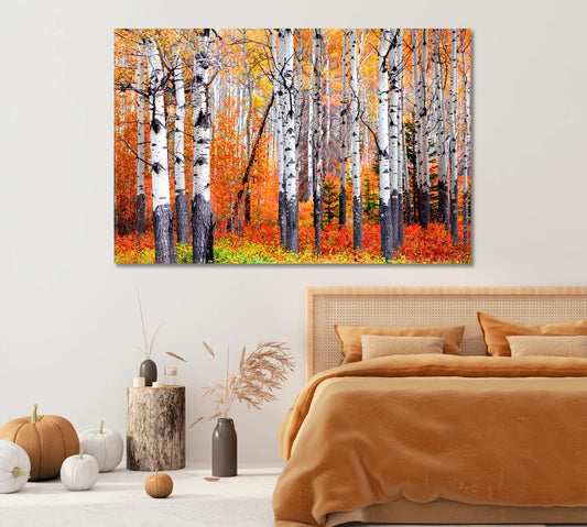
Music Lovers’ Den: Vinyl-Inspired Pop-Art Posters for Media Walls
Media walls don’t have to be only screens and speakers. With vinyl-inspired pop-art posters and canvas prints, you can build a room that nods to the golden age of records while feeling bold and current. This guide covers mood, layouts, size rules, frames, lighting, and easy styling moves—plus 15 curated picks to start building your setup.

Why vinyl pop-art suits media walls
Media walls are visual focal points. Pop-art’s punchy color blocks and high contrast hold up well beside a bright OLED or projector. Vinyl imagery adds instant context: you’re here for music, movies, and sound—so let the wall say it proudly.
“If your living room has a heartbeat, it’s the media wall. Give it album-cover attitude.”
Internal inspiration: browse Music Wall Art and Pop-Art Posters to notice how bold palettes read clearly from seating distance.
Color themes: neon vs. warm analog
Neon & club lights
Think cyan/magenta, disco gradients, light leaks. These pair well with LED bias lighting behind the TV and RGB strips along shelves. They visually “sync” with animated screensavers and music UIs.
- Use two bright accents, keep the rest neutral.
- Repeat a highlight color in pillows or a rug.
- Metallic frames (brushed black) keep it sharp.
Warm analog
Sepia, amber, and desaturated reds echo tube amps and wood speakers. They calm the wall when the TV is off and pair nicely with walnut consoles and linen textures.
- Matte frames reduce reflections from fixtures.
- Use off-white mats to soften deep blacks.
Layouts that groove with screens
The TV is your visual anchor. Arrange posters so the overall silhouette hugs the display instead of fighting it. Common wins: a tight horizontal triptych above a soundbar, a 2×3 grid to the side of a projector screen, or a long shelf with stacked frames.
Three quick formulas
- Triptych over console: three verticals, equal gaps (1.5–2 cm), outer edges aligned with TV width.
- Grid beside screen: four squares; keep the centerline level with mid-screen height.
- Record-shelf look: a picture ledge with album-style posters layered slightly.
Size & spacing rules around a TV
As a rule of thumb, the art cluster should span 60–90% of the TV width. Maintain a consistent gap between frames—usually 1.5–3 cm feels crisp at sofa distance. Leave at least 10–15 cm of breathing room above a media console.
Frames, mats & finishes
Thin aluminum frames in black or brushed gunmetal echo headphone bands and amp hardware. For posters with heavy color, a white mat creates a little “pause” and helps with readability from across the room. Choose matte or anti-glare glazing if you have windows opposite the media wall.
Lighting that flatters art & screens
Bias lighting behind the TV can reduce perceived glare and eye strain while boosting perceived contrast. Pair that with small picture lights or adjustable track heads angled at 30° to avoid reflections on glazing.
Dive deeper: bias lighting explanation.
Editor’s Picks — Turntables & Tones

Vinyl Record Player — Canvas Print
A crisp stylus close-up: perfect over the console for an instant “now playing” vibe.

Record Player with Red Vinyl
A vertical stunner that stacks neatly left or right of your TV.

Vintage Record Player
Warm analog palette—pairs beautifully with walnut furniture.

Headphones on Vinyl
Club-style magenta/cyan lighting that pops in low light.

Retro Boombox 1980s
Throwback energy—great above a soundbar or record cabinet.
Motifs: turntables, cassettes & mics
Use a single family of objects for cohesion. A row of turntables says “DJ set.” A triptych of cassettes feels nostalgic with modern edges. Microphones and jazz silhouettes lean loungey and intimate.
Pop-art treatment that reads from afar
High-contrast shapes, limited palettes, and halftone textures stay legible at 2–3 meters. Duotone treatments (e.g., cyan + orange, magenta + blue) are easy to echo in LED bias lighting. Keep busy details to a minimum in the central sightline.
Blend with jazz/cubism portraits
A media wall gains depth when one or two pieces step outside the turntable theme. Add a cubist guitarist or a smoky vocalist portrait to create a visual “bridge” to furniture fabrics and wood tones.
Editor’s Picks — Retro Tech
Retro Ghettoblaster
Stack over a vinyl crate for instant playlist energy.
Astronaut with Boombox
A playful twist that keeps the wall from feeling too serious.
Retro Audio Tapes
Cassettes add rhythm and modular grid options.
More retro-tech picks to mix in: Record Player Canvas Print, Ethnic Music Instruments.
DIY vinyl touches
Line a shallow picture ledge with a few 12-inch sleeves between framed posters. Add a small wall hook to hang your favorite over-ear headphones beneath a print. If you have a shelf under the TV, place a single-tube amp or cassette deck as “functional decor.”
Sound: basic room tuning
Fabric sofas, rugs, and curtains absorb reflections so your speakers sound cleaner. If the room is lively, add soft surfaces on the wall opposite the speakers. A few well-placed absorbers and diffusers can help—nothing elaborate is required for most living spaces.
Background reading: room acoustics overview.
Hanging & safety
Use quality hardware. For frames near a TV, double-check cable paths and avoid drilling above power runs. When mounting under a projector screen, leave clearance for the drop and keep glare off glass by angling lights to ~30°.
Speaker placement tips: see Dolby’s home setup notes.
Editor’s Picks — Spotlight Posters
Guitarist in Cubism Style
Graphic angles that harmonize with speaker grilles.
African American Jazz Guitarist
A moody portrait that pairs with tube-amp warmth.
Jazz Singer with Microphone
Square formats stack neatly in grids beside your TV.
Round out the wall with: Still Life with Guitar and Lilac, Abstract Geometric Pop-Art Poster.
Care & anti-glare tips
- Dust frames with a soft microfiber; avoid chemical cleaners on glazing.
- Use matte or anti-glare glazing if windows face the media wall.
- Keep art out of harsh, direct sunlight to preserve inks.
Quick checklist
- Pick a palette (neon/club or warm analog) and repeat it twice in the room.
- Plan a layout that hugs the TV silhouette (triptych, grid, or ledge).
- Keep cluster width at 60–90% of the TV.
- Use consistent gaps (1.5–3 cm) and align centers at seated eye level.
- Add bias lighting + one adjustable art light per key piece.
- Mix 1–2 portraits with turntable/cassette motifs for depth.
All 15 curated CetArt picks from this guide
- Vinyl Record Player — Canvas Print
- Record Player with Red Vinyl Record
- Vintage Record Player with Vinyl Disc
- Black Headphones on Vinyl Record
- Retro Boombox 1980s
- Retro Ghettoblaster
- Retro Audio Tapes
- Record Player Canvas Print
- Guitarist in Cubism Style
- African American Jazz Guitarist
- Jazz Singer with Microphone
- Ethnic Music Instruments
- Still Life with Guitar and Magnificent Lilac Flowers
- Abstract Lemon Cut Vinyl Record
- Astronaut with Retro Boombox
Broader browsing: Music Wall Art • Pop-Art Posters • Posters for Room
FAQs
How many posters should sit around a 65-inch TV?
A cluster roughly 60–90% of the TV width feels balanced. For a 65-inch display, that’s often 90–135 cm total width. Try a three-piece set or a tight 2×2 grid.
What frame finish pairs best with audio gear?
Brushed black or gunmetal frames echo headphone bands and amp faceplates. Matte finishes reduce reflections from lamps and windows.
Is bias lighting worth it behind a TV?
Yes—neutral-white bias lighting improves perceived contrast and reduces eye strain. It also makes pop-art colors feel more saturated without glare.
Should I mat pop-art prints?
For very saturated work, a white mat creates breathing room and improves readability from the sofa. If you love edge-to-edge color, go mat-less and keep gaps consistent.
How high do I hang art above a media console?
Leave 10–15 cm above the console and align the art’s visual center close to seated eye level (~100–110 cm from floor), adjusting for screen height.
Can I mix photographs with illustrated pop-art?
Absolutely. Keep cohesion via color: repeat one accent across pieces (e.g., red label, cyan highlight) so the wall feels like one composition.
What sizes work for a vertical stack beside the TV?
Try three verticals at 40×60 cm (or similar) with 1.5–2 cm gaps, or two taller 60×90 cm pieces if the wall is high.
How do I avoid reflections on glass?
Use matte glazing and angle picture lights at ~30°. Avoid placing lamps directly opposite the media wall.