Warm Metals, Cool Art: Gold-Accent Frames with Navy Canvases
Navy brings calm and depth; gold adds highlight and warmth. This guide shows how to pair them without guesswork—palettes, frame finishes, size rules, and real pieces you can use.

Why navy + gold works
Navy is calm and grounded; gold is bright and warm. Together they create a simple balance: cool field, warm highlight. That’s why a deep-blue canvas can carry a gold-accent frame without feeling heavy.
Use navy as the large surface (art background, wall color, or textiles). Let gold appear in thin lines: frame edges, lamps, or hardware. The result is clear and tidy, not loud.
“Design is where science and art break even.” — Robin Mathew
Choosing your navy (and neighbors on the palette)
Not all “navy” is the same. On the cool side you’ll see inky midnight blues; on the friendlier side, teal-leaning blues. Either works with gold, but each tells a different story.
Deep navy
Think midnight or indigo. Pairs well with matte brass, walnut, and charcoal. Great behind neutral sofas and stone tops.
- Add a small ivory or linen mat to lighten the overall frame stack.
- Keep other metals minimal so the frame stays the bright note.
Teal-shifted navy
Skews a touch green. Works with antique gold and cognac leather. A nice bridge for rooms with plants or warm wood floors.
- Let one item repeat the teal (a cushion or throw). One echo is enough.
- Choose gold that is slightly muted to avoid a harsh contrast.
Want to browse by style? Try Modern Wall Art and filter by blues, or dip into Abstract Modern Art for ink, marble, and wave patterns.
Gold-accent frames: finishes that match
Matte brass
Soft reflection, forgiving with fingerprints, and friendly to both deep and teal-shifted navies. Good default if you’re unsure.
Brushed gold
Shows a linear texture that feels modern. Best with crisp abstracts and city lines.
Antique gold
A hint of patina adds depth. Great partner for ocean scenes and onyx-style marbles.
Do I need a mat?
If the art has busy detail near the edges, a slim off-white mat gives the piece room to breathe. If the art already has a white or light border, skip the mat.


Where this combo shines at home
Living room feature wall
A navy canvas over the sofa anchors the seating zone. Use a gold-accent frame to echo lamp bases or a coffee-table tray.
Dining area
Abstracts with thin gold veins feel lively near glass and polished flatware. One centered piece keeps sightlines clear.
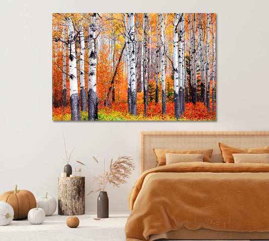
Bedroom calm
Choose darker blues with small warm notes. Linen bedding and walnut nightstands keep the look grounded.
Sizing rules over sofas, consoles, and beds
As a quick guide, aim for artwork width between 60–80% of the furniture below it. If you’re using multiple panels, the overall width is what counts.
- Sofas: 36×24" to 60×40" (single panel), or triptychs sized to the same overall width.
- Beds: 36×24" over a full/queen; 54×36" or wider over a king.
- Consoles: Keep the art a little narrower than the console length.
See the Canvas Sizing Guide for visuals and multi-panel diagrams.
Layout ideas: single, diptych, triptych
Single panel: clean choice for rooms with multiple surface finishes. A slim gold frame handles the highlight.
Diptych: two panels with a small 1–2 cm gap look crisp above consoles and sideboards.
Triptych: three panels bring rhythm to long walls. Align top edges; keep gaps even.


Mixing metals without chaos
Use one metal as the “lead” and others as supports. If your frame is gold, keep chrome or black metal to small items (handles, a bookend, a tray edge).
Repeat gold in two other places—lamp base and picture light, for example—to make the choice feel deliberate.
Lighting: keeping glare in check
Gold can reflect; aim lights so glare doesn’t bounce into your eyes. A slim picture light or two ceiling spots at 30–45° usually does the trick.
For glossy pieces, use lower-brightness bulbs and a warmer color temperature (~2700–3000K) so the frame glow feels gentle.
Need a deeper dive on canvas construction and finishes? See Canvas Print — Info.
Textiles, woods & stones that play nicely
Textiles
- Linen, bouclé, velvet in sand, ivory, slate, and teal.
- One or two patterned cushions are enough—let the art stay center stage.
Surfaces
- Walnut, oak, and travertine soften deep blues.
- Black stone or dark wood tightens the look for a sleek vibe.


Hanging & care tips
- Center art at ~145–155 cm from the floor to the middle of the piece.
- Use two hooks for wide canvases; they keep frames level.
- Keep canvases away from direct sun and strong heat sources.
- Dust with a dry microfiber cloth; skip chemical cleaners.
More how-tos and ideas live on the CetArt Blog.
Quick planner: pick, frame, place
1) Pick
Choose a navy canvas with one warm note (gold flecks, sunlight, brass tone) so the frame has something to echo.
2) Frame
Start with matte brass, adjust brighter or darker based on your lamps and hardware.
3) Place
Hit the 60–80% width zone over furniture. If in doubt, use painter’s tape on the wall to preview size before drilling.
Wrap-up
Navy canvases bring calm; gold frames add spark. Keep gold as the accent, let blue lead, and use clear size and layout rules. With a couple of smart choices, the look lands every time.
FAQs
What gold frame finish works best with navy?
Matte brass is the easy starter. Go antique gold for ocean scenes and marbles; pick brushed gold for crisp abstracts or city lines.
How wide should the frame be?
As a guide, 1/18–1/12 of the artwork’s shortest side. Slim profiles feel modern and keep focus on the art.
Do I need a mat around a canvas?
Canvas prints typically don’t require a mat. If you frame a paper print, a thin off-white mat can help busy edges breathe.
Can I mix gold with black or chrome in the same room?
Yes—keep gold as the lead metal. Use the others in small doses so the room feels coordinated.
What size should I choose over a sofa?
Aim for 60–80% of the sofa width. For multi-panel sets, include the gaps when you calculate total width.
Where should I hang navy & gold art?
Feature walls in living rooms, above consoles in dining areas, and above headboards in bedrooms are reliable spots.
How do I avoid glare on a gold frame?
Angle lights ~30–45°, use warm bulbs, and avoid placing spotlights directly in front of the frame.
What if my room has warm wood floors?
That’s a win—warm wood supports the gold. Add one cool element (a slate cushion or steel tray) to keep balance.
References & further reading