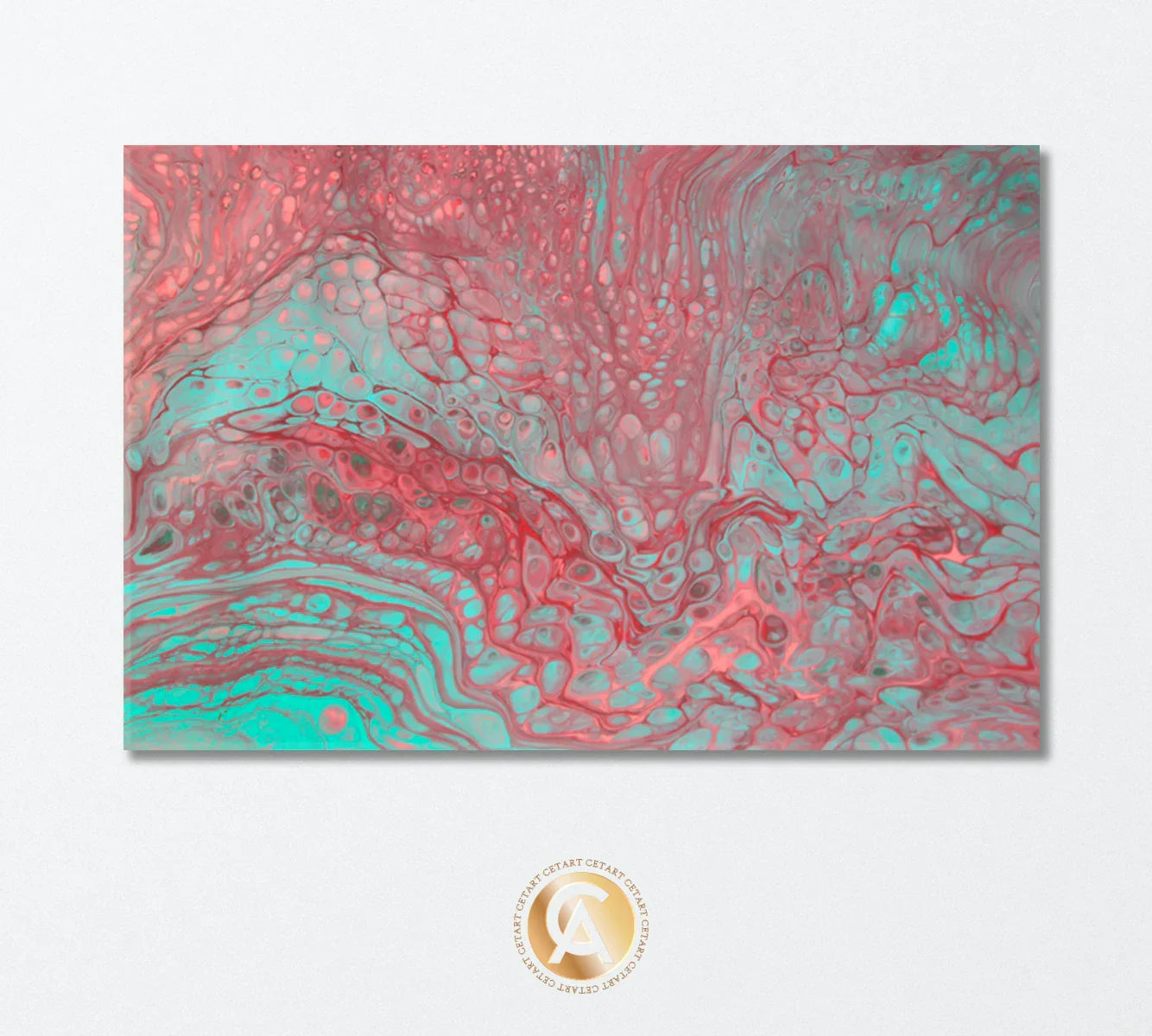
Abstract Pink & Blue Acrylic Bubbles Canvas Print — Fluid Color for Serene, Modern Rooms
Introduction & Context: why fluid acrylics feel so right now
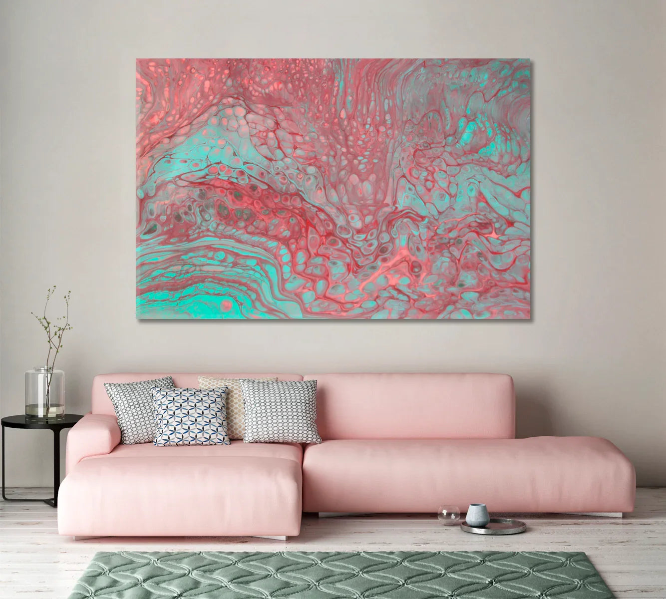
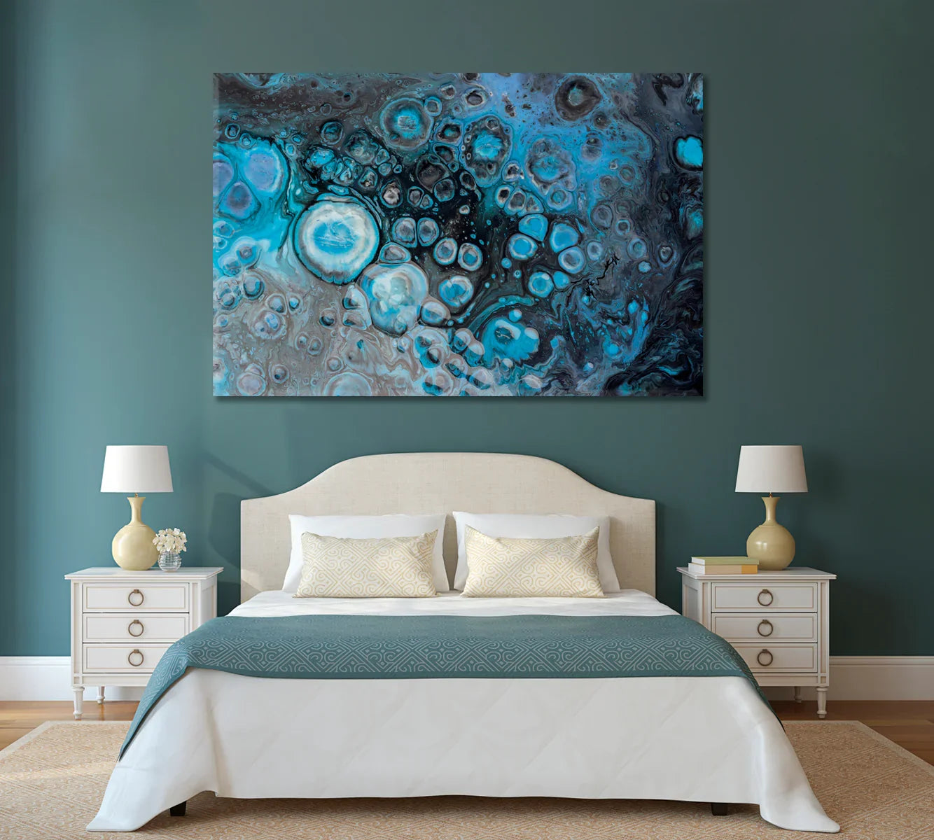
When you’re curating a room, color does the emotional heavy lifting. Fluid acrylic art captures that emotion in motion — pigments stretching, pooling, and blooming into organic “cells” that give your walls both serenity and energy. Our Abstract Pink & Blue Acrylic Bubbles canvas blends muted coral with lagoon blue to create a tranquil focal point that pairs effortlessly with Scandinavian, coastal, boho, and soft-modern interiors.
Over the past few seasons, homeowners and designers have gravitated toward artwork that softens minimal spaces and warms cooler palettes. Pastel-adjacent hues — blush, dusty rose, seafoam, and teal — are central to this shift. This piece taps into that palette without feeling sugary or loud; the layered texture keeps it sophisticated, while the bubble-cell pattern adds a contemporary, almost meditative rhythm. Whether you’re brightening a living room with a light sofa, finishing a restful bedroom, or giving an office a creative lift, this canvas reads as calm but not quiet.
Equally important is practicality. This canvas is delivered ready to hang, with the print stretched over durable wood stretcher bars and protected with a multi-layer finish designed for long-term vibrancy. That means you can focus on styling instead of framing logistics — a major advantage when you want instant impact with minimal effort.
Product Deep Dive: texture, color science, and build quality
The visual language here is all about contrast in harmony. Coral-pink passages introduce warmth, while blue-green notes cool the composition and keep the eye traveling. The organic cells — a hallmark of fluid acrylic techniques — create micro-details that reward close viewing without overwhelming the room. From ten feet away, you get a gentle gradient and subtle movement; up close, you’ll notice marbling and lacing that feel crafted and tactile.
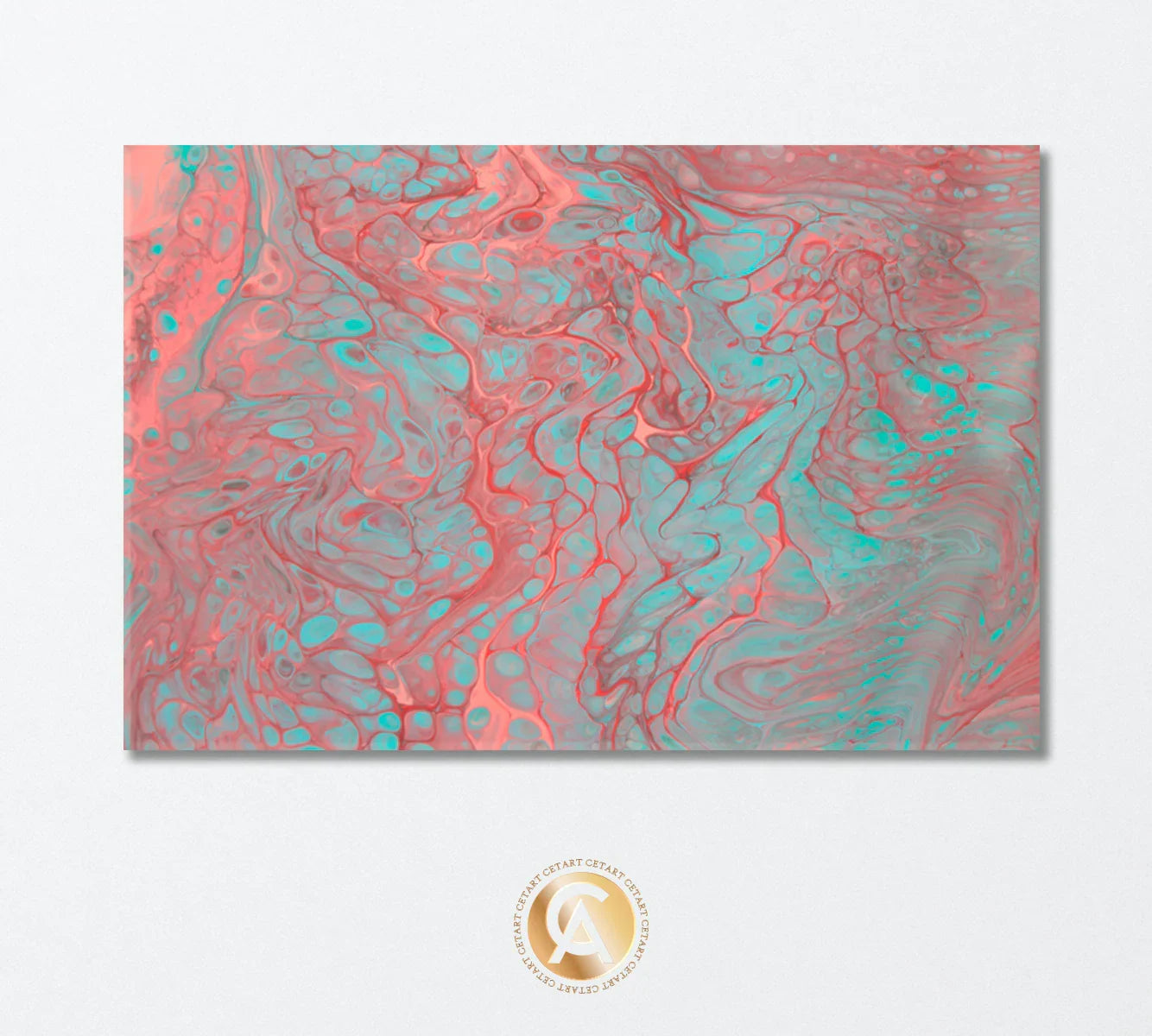
Each canvas is made to order and arrives ready to hang on solid stretcher bars with a smooth, durable wrap. The print surface is engineered for crisp detail and long-lasting color fidelity, maintaining saturation even in bright, naturally lit spaces. The protective finish resists dust and light moisture, so maintenance stays simple and stress-free. Because the artwork is stretched rather than framed, the piece floats slightly off the wall, casting a clean shadow line that looks especially premium in contemporary rooms.
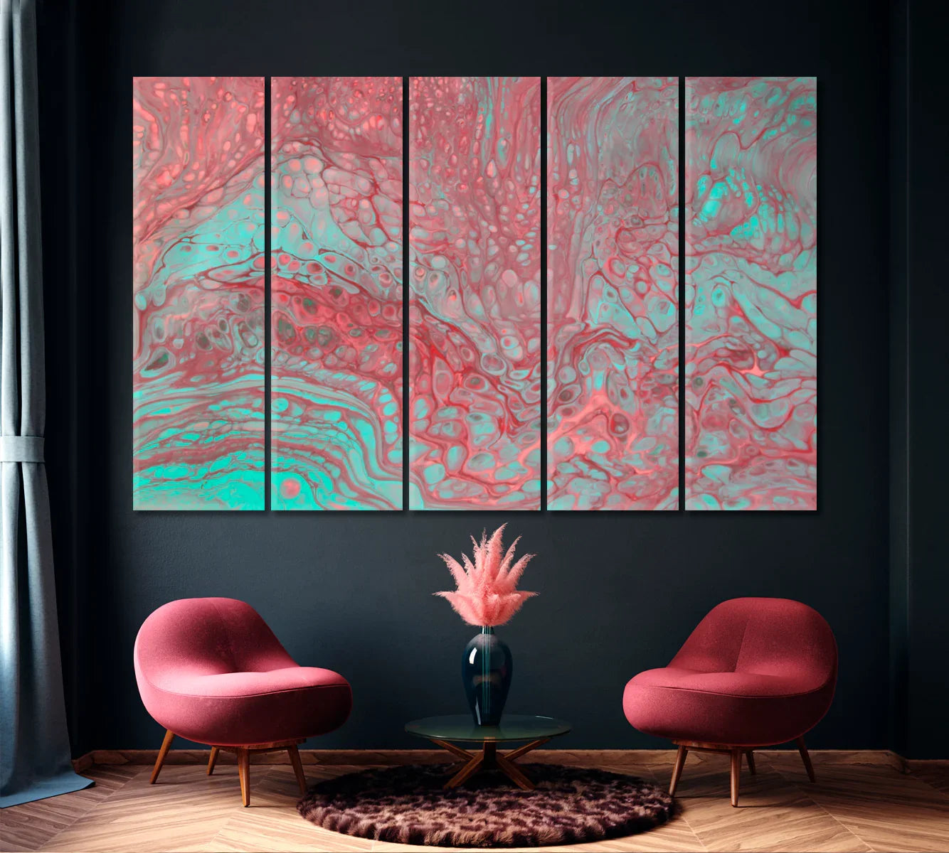
Available as a single panel or multi-panel set, the artwork scales elegantly. The single panel emphasizes the flow of color as a unified field, ideal for sofas or beds. Three-panel and five-panel options break the movement into rhythmic columns — a striking look on long walls or in spaces where architectural lines (moldings, windows, shelving) already segment the view. No matter the format, the color story remains consistent, so you can style with throws, vases, or area rugs in whisper-pink, sage-green, teal, and warm greige.
Pro tip: Treat soft pinks like a neutral. When paired with greyed blues and light woods, blush behaves almost like beige — calm, adaptable, and timeless.
Complete the look with coordinating abstracts
Who loves this piece: detailed buyer stories
The Soothing Minimalist (late 20s–40s) — lives in a rental or first home, favors pale walls and clean lines. They want a calm anchor that softens minimal furniture. Their concern: “Will pink feel too sweet?” This canvas wins them over with muted coral and cool turquoise that reads sophisticated, not saccharine. It’s the one statement that doesn’t compete with their pared-back space.
The Color-Curious Professional (30s–50s) — builds a home office where Zoom backdrops matter. They’ve tried black-and-white prints and found them too stark. This piece adds gentle color gradation and visual depth behind the desk, improving on-camera presence while staying polished. They appreciate the ready-to-hang format and scale options for different wall widths.
The Serene Bedroom Seeker (all ages) — prioritizes rest and wants art that lowers visual noise. They’re replacing busy gallery walls with one cohesive canvas. The smooth bubble texture and spa-like palette promote calm, pairing beautifully with linen bedding and warm wood nightstands.
The Coastal-Modern Enthusiast — gravitates toward seafoam greens, bleached woods, and airy fabrics. They considered ocean photography but prefer something more interpretive. This abstraction nods to waves and shoreline minerals without being literal, making it timeless through trend cycles.
The Gift Giver — shopping for new homeowners, newlyweds, or downsizers refreshing a condo. Unsure about exact paint colors, they choose this canvas because it plays nicely with white, greige, and light sage — and it arrives ready to hang. Multi-panel options make larger walls easy to fill without hunting for matching frames.
The Budget-Wise Upgrader — wants premium presence without custom framing costs. Compared to framed prints and oversized posters, a stretched canvas offers scale and dimensionality at strong value. They love that the artwork looks “finished” the moment it’s on the wall.
The Statement Host — loves entertaining and creates conversation corners. Five-panel layouts become a graphic backdrop in dining rooms or lounges. Guests lean in to explore the cellular details, and the palette complements both soft cocktails and candlelight.
Gifting occasions: thoughtful uses all year
Weddings & Housewarmings: A modern, soothing palette that blends with most registries. Message idea: “Wishing you a home that feels calm and inspired every day.” Choose a single panel in 36×24 in for average living rooms; upgrade to 47×31 in if the couple has a sectional.
New Baby Arrivals: For nurseries leaning pastel without clichés, this canvas brings gentle movement that toddlers grow into. Suggest the 24×16 in above a dresser; it’s light, secure, and easy to shift as the room evolves.
Graduations & First Apartments: A ready-to-hang piece is a relief for new grads juggling moves. Include a note: “Art for your next chapter — calm color for big ideas.” Pair with a neutral throw for a mini “apartment starter” bundle.
Anniversaries & Milestones: For partners who prefer meaningful gifts over gadgets, art signals longevity. The calming hues suggest steadiness and care. If the bedroom needs a refresh, a 47×31 in single panel above the headboard sets a serene tone.
Recoveries & Encouragement: Healing spaces thrive on soft, optimistic color. Position above a reading chair with a small plant and warm lamp. Choose canvases over glass-framed art to reduce glare and keep edges soft.
Holiday Gifting: Avoid last-minute scrambling by selecting early. A 36×24 in single panel suits most homes; multi-panel options create a big-impact reveal for family rooms. If shipping to different addresses, include a gift note at checkout and consider sending the sizing guide link in advance.
Corporate & Client Appreciation: Offices benefit from calm yet creative art in meeting rooms and lounges. This palette plays well with grey systems furniture and plant greenery. For wider walls, three-panel sets in 54×36 in command presence without feeling heavy.
Group Gifting: Friends can easily split the cost of a larger size — designate one person to confirm wall measurements and sofa width (see calculator below) to choose the ideal fit.
When to buy: seasonal cues & planning
Spring refreshes often call for airy, optimistic color — this canvas shines when you’re swapping heavier textiles for lighter ones. Summer entertaining benefits from a statement over the sofa or sideboard. In autumn, the coral notes echo warm woods and terracotta accents; in winter, the teal brings clarity to cozy neutrals.
Planning ahead helps: consider sizing and wall placement a few weeks before major gatherings or holidays. If you’re building a gallery of abstracts, shop off-season to secure larger sizes and coordinate palettes at a relaxed pace.
“Design is intelligence made visible.” — Alina Wheeler
Where it thrives: room-by-room guidance
Living Room: Center a 47×31 in single panel 6–8 inches above the sofa. Pair with pale oak, boucle, and a teal glass vase. If your sofa is under 80 in wide, a 36×24 in panel maintains proportion without overwhelming the seating.
Bedroom: Above a queen headboard (60 in wide), try 36×24 in for subtlety or 47×31 in for hotel-style presence. Layer in stone-washed bedding and a dimmable wall sconce to echo the canvas’s soft glow.
Home Office: Position behind your chair to create a calm yet engaging video backdrop. Add a plant with rounded leaves to mirror the bubble motif. Keep clutter low; the texture will do the talking.
Dining Room: A five-panel set energizes long walls while keeping sight lines open. Style with matte ceramics and blush napery for understated cohesion.
Entry & Hallways: Use a 24×16 in over a console, anchored by a round mirror. The organic pattern draws visitors in and guides the eye down the corridor.
Palette Pairings: Works beautifully with warm whites (think “Swiss Coffee”), soft greige, salvia green, and dusty teal. Metallics: brushed brass or champagne gold. Fabrics: linen, boucle, cotton duck, and ribbed knit throws.
Specifications, sizing & options
Available formats: 1-panel, 3-panel, and 5-panel canvas sets. Common sizes (WxH): 24×16, 36×24, 47×31, 54×36, 60×40, 71×48, 83×55 inches.
| Overall Width (in) | Height (in) | Recommended Rooms |
|---|---|---|
| 24 | 16 | Entry, hallway, nursery, small office |
| 36 | 24 | Bedrooms, modest living rooms |
| 47 | 31 | Main living rooms, dining rooms |
| 54 | 36 | Large living rooms, executive offices |
| 60 | 40 | Open-plan spaces |
| 71 | 48 | Great rooms, long hallways |
| 83 | 55 | Statement walls and lofts |
Find your perfect size
Enter your furniture width, and we’ll suggest a canvas width around two-thirds of that (a time-tested rule for balanced proportions).
Care & longevity
Dust lightly with a soft, dry cloth or microfiber duster. Avoid harsh chemicals and direct, prolonged sunlight to preserve color depth. For kitchens or high-traffic areas, place the canvas away from steam sources and exterior doors to minimize environmental stress. If a light mark appears, a barely damp cloth (water only) can be used gently — no scrubbing.
Expect long-term vibrancy thanks to the protective finish and quality print surface. If you plan to rotate art seasonally, store the canvas upright in a dry, temperate area with a breathable cover.
Why choose this canvas over alternatives
Compared with framed posters, a stretched canvas offers dimension, scale, and a premium edge-wrap presentation without the cost and glare of glass. Against literal photographic seascapes, this abstract keeps things timeless and versatile — it nods to water and mineral patterns without locking you into a theme. Multi-panel options provide large-wall flexibility that many prints can’t match, and the ready-to-hang format removes friction from the setup process.
In short: modern serenity, real texture, flexible sizing, and strong value.
Frequently Asked Questions
What sizes work best over my sofa or bed?
A quick rule: choose a canvas around two-thirds the width of the furniture below it. Use the calculator above to get a personalized recommendation from the available widths.
Is the canvas ready to hang?
Yes — it arrives stretched on sturdy wooden bars with hanging hardware, so you can mount it right away.
Will the colors match my paint and textiles?
The palette blends coral-pink, teal, and soft blue-green with gentle grey undertones. It complements warm whites, greige, sage, seafoam, and natural woods. Because every screen differs, view the in-room photos for realistic context.
Single panel or multi-panel — how do I choose?
Single panels feel calm and continuous; multi-panel sets add rhythm on long walls and open spaces. If your wall exceeds ~9 feet, consider a three- or five-panel layout for stronger presence.
How should I care for the artwork?
Dust gently with a dry cloth, keep chemicals and direct sunlight to a minimum, and avoid areas with heavy steam. For storage, keep upright in a temperate, dry place with a breathable cover.
Is this good as a gift?
Absolutely. It’s universally appealing and works across many styles. For gifting, 36×24 in is a safe choice for most rooms; include a note with hanging suggestions.
What if I’m styling a very narrow wall?
Try the 24×16 in size vertically (if the design allows) or place it over a console with a table lamp to create a balanced vignette.
Which rooms benefit most from this palette?
Spaces where calm focus matters — bedrooms, offices, reading corners, and light-filled living rooms. The cool-warm mix plays well with plants and natural textures.
More to explore
Browse the full Abstract Modern Art collection, or discover additional formats and topics on the collections page. For styling tips and room ideas, visit the design blog.
A calm focal point with versatile color
Abstract Pink & Blue Acrylic Bubbles brings soft movement and layered detail to modern spaces. From small entries to expansive living rooms, the format options make fitting your wall a breeze — and the ready-to-hang build means instant transformation the day it arrives.