Share
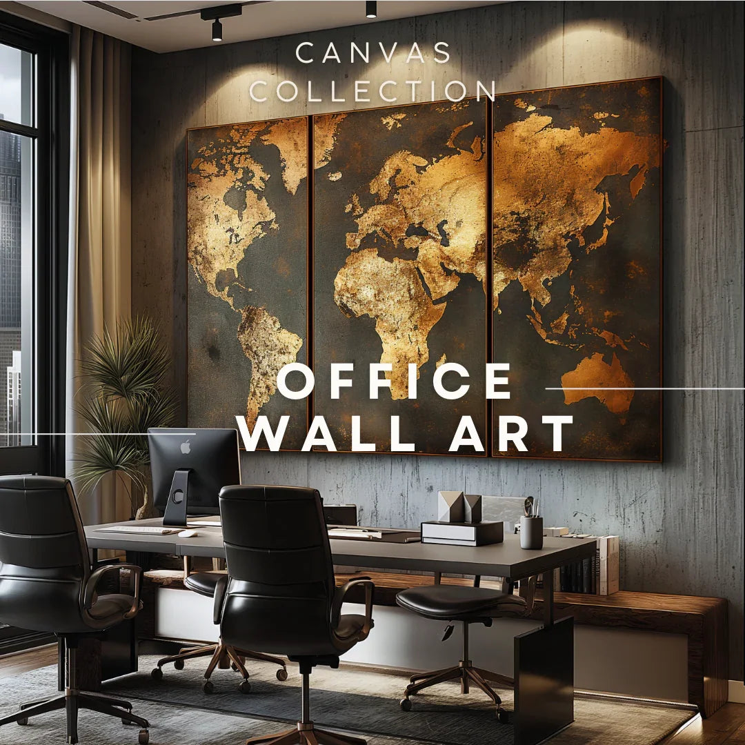
Neutral Palette Office: Beige, Sand & Blue Abstract Canvases
This guide shows how beige, sand, and soft blues help keep teams focused while keeping rooms warm and easy to work in. You’ll learn simple color mixes, sizing rules for desks and meeting rooms, and where abstract canvases shine across an office.
Why neutral + blue works for offices
Neutral walls and furniture already carry a lot of the room. Abstract canvases in beige and sand blend in without stealing focus, while blue adds just enough contrast to keep the eye awake during long work hours.
Anchor the room with one larger abstract; support it with smaller, quieter pieces where people sit or wait.
The palette formula (sand, beige, blue)
70 / 20 / 10 rule
- 70% beige & sand (walls, big furniture, rugs)
- 20% soft blues (main canvas or two mid-sized ones)
- 10% dark accents (charcoal frame, ink blue linework)
Let canvas art supply most of the room’s blue; keep other blue items minimal.
| Tone | Hex ballpark | Use |
|---|---|---|
| Warm Sand | #D8C7A2 | Base color (walls / rug) |
| Soft Beige | #E9E0D2 | Seating / storage fronts |
| Muted Blue | #6FA6C8 | Feature canvas / trim |
| Ink Blue | #214A6B | Frame / small accents |
“Color should support the task at hand, not compete with it.”
Canvas sizes that read well at work
For common desk and corridor distances (1.5–3 m), textural abstracts with clear movement read best. Go wider for lounges and long tables; taller shapes suit hallway niches.
- Single panel: 36×24″ and 47×31″ handle most walls without crowding.
- Triptych: spreads detail across the wall and reduces glare spots.
- Five-panel sets: useful for long lounges; keep tight spacing.
If you’ll leave gaps between panels, remember the overall width grows by the gap total.

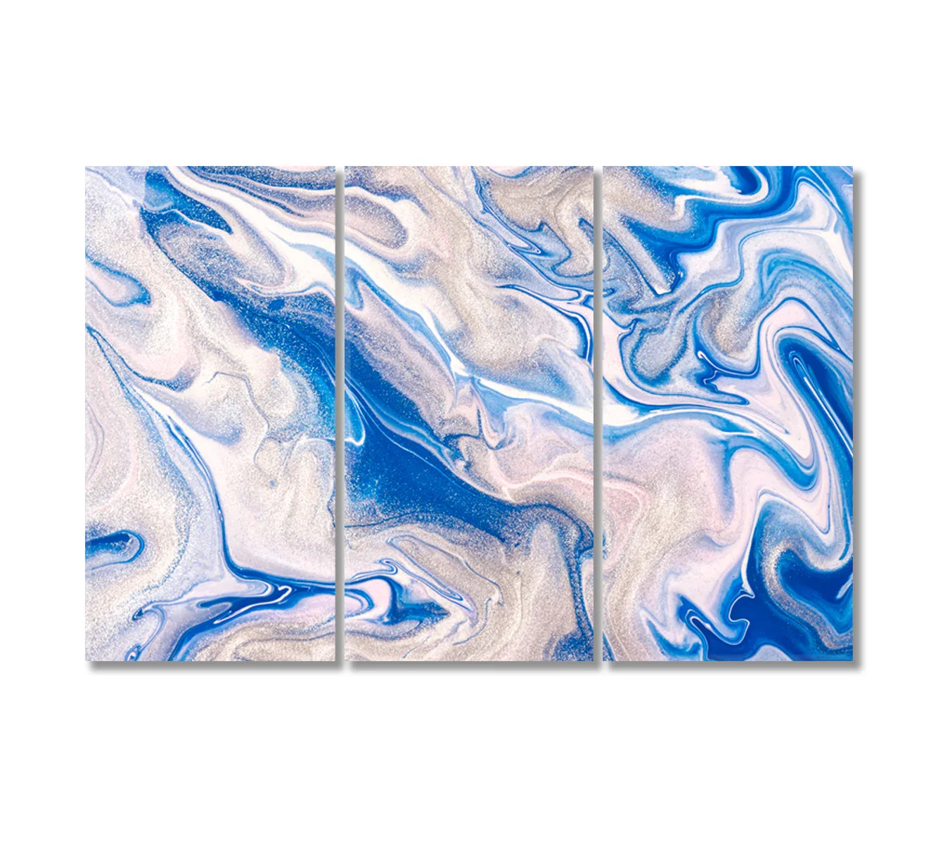
Abstract Blue Fluid Pattern Canvas Print
Cool flow for focus walls near desks.

Abstract Blue Agate Canvas Print
Layered bands add depth without noise.

Abstract Blue Wavy Marble Canvas Print
Gentle rhythm for long walls and corridors.
Above desks: calm but not dull
Choose pieces with clear direction so the eye can “scan” them quickly, then return to the task. Keep frames slim and matte; glare near monitors is distracting.
Quick picks
- One mid-size abstract above each desk is better than small clusters.
- Favor soft edges over hard geometry to avoid visual tension.
- Keep the bottom edge ~20–25 cm above the desk for cable clearance.
Meeting rooms: keep attention on people
In rooms where talk matters, a single canvas in sand and beige supports the mood while staying out of the way. Bring blue in sparingly—one bold stroke or a narrow band is enough.
Hang the center of the main canvas about 145–155 cm from the floor so everyone sees it seated or standing.
Lobbies & lounges: a friendly first look
Here, a larger piece can introduce the color story. Blue reads fresh and neat; sand and beige keep it warm for guests and teammates moving through the space.

Modern Blue Acrylic Liquid Swirl Abstract Pattern
Good for creative zones and whiteboards opposite.

Abstract Smoky Gray Marble Canvas Print
Pairs well with black screens and metal legs.

Modern Abstract Blue Bubbles Pattern
Playful texture for lounges; still clean from afar.
Pairing with wood, stone, metal
Light oak, birch, ash
Use blue-led abstracts to offset yellow wood tones. Choose white or black frames to match desk legs.
Concrete & stone
Sand and beige pieces add warmth; keep the texture visible by using thin frames and minimal spacing.
Black steel
Gray or ink blue lines tie into hardware and lighting tracks. Matte finishes prevent reflections across the table.
Lighting tips for neutral art
- Use 3000–3500K for sand/beige, 3500–4000K if the blue needs a bit more pop.
- Avoid hard spots; aim for even wall-wash at ~30° to reduce glare.
- Dim during screen-heavy meetings; brighten for walk-throughs.
If glass reflections are an issue, consider canvas without extra glazing and keep lights off the direct sight line.
Layouts: single, diptych, triptych
Single panels feel steady and are fastest to install. Diptychs balance narrow walls; triptychs suit long seating runs. Keep gaps small (2–4 cm) so the image still reads as one idea.

Pampa Grass Canvas Wall Decor Prints
Soft sand tones for quiet rooms.

Dry Beige Plant Canvas Interior Design
Neutral support for reception or printer corners.

Abstract Liquid Blue Beige Marble Canvas Print
Bridges blue features with sandy seating and wood.
Care & placement basics
- Keep canvases out of direct sun and away from vents.
- Dust with a clean, dry microfiber cloth; avoid chemicals.
- Use two hooks for frames 36×24″ and larger to stop tilting.
When in doubt, lay artworks on the floor first and snap a quick phone photo—editing the layout is easier before drilling.
Need more ideas?
Browse more neutrals and soft blues in these collections:
FAQs
What canvas size works above a 160–180 cm desk?
36×24″ is a safe start; go 47×31″ if the wall is wide and seating is pulled back.
How high should I hang a canvas in a meeting room?
Center at ~145–155 cm from the floor so it reads well seated and standing.
Should I frame neutral canvases?
Float frames in black or light oak look clean. Keep frame depth slim to avoid shadows on the image.
Triptych or single panel for long walls?
Triptych spreads highlights and reduces glare; keep gaps 2–4 cm.
How do I avoid glare from lights and screens?
Use a 30° wash from track or wall lights; avoid fixtures pointing straight at the canvas.
Do blue abstracts feel cold?
Pair them with sand/beige rugs, wood desks, and warm white lighting (3000–3500K) to balance the feel.
Can I mix photography with abstracts?
Yes—keep one category dominant. In a neutral office, let abstract canvases lead and add one photo piece as a quiet accent.
What if I plan to add more screens later?
Leave 10–15% of wall width free for future devices and run art in zones away from glare.
References
