Autumn Switch-Outs: Terracotta Florals & Vintage Botanicals
Cinnamon-warm terracotta, timeworn botanical plates, and dried florals are the fastest way to make your rooms feel snug without repainting a single wall.

Why terracotta works in fall
Terracotta (literally “baked earth”) is an earthy orange with muted brown undertones. It reads grounded, sun-warmed, and nostalgic—exactly the energy we want when the light gets softer and the evenings get longer.
Best companions: sage, olive, cream, bone, dusty blue, inky charcoal.
What makes botanicals feel “vintage”
Vintage botanicals are rooted in old herbarium plates and lithographs—think linework, Latin labels, and parchment-toned paper. Even when reimagined as modern prints, they bring a scholarly calm and a collected feel.
- Paper look: cream, buff, or foxed edges add age.
- Muted inks: olive greens, inky blues, terracotta accents.
- Specimen logic: stems, leaves, bulbs arranged flat—very “cabinet of curiosities.”
Terracotta + sage + cream (with a hint of ink)
Use terracotta as your accent, sage as the bridge to natural woods, cream as the base, and just a dash of inky charcoal for contrast.
- Terracotta
- Throws, vases, canvas art backgrounds.
- Sage
- Botanical leaves, kitchen textiles, frames.
- Cream
- Mats, sofa, lampshades—the “quiet” layer.
- Ink
- Thin black frames, line-art posters, hardware.
Curated picks: warm terracotta botanicals

Pampa Grass Canvas
Dry Beige Plant Canvas

Shabby Chic Peony

Peonies Canvas Print

Flowers in Bottle Canvas
Tip: pair any of the above with terracotta pots and linen pillows for instant seasonal cohesion.
Living room switch-outs
Keep your big pieces neutral, then rotate art and textiles. A single wide canvas over the sofa or a tidy triptych above a console anchors the room.
- Swap summer blues for terracotta cushions & a wool throw.
- Add one large floral canvas to steer the palette.
- Layer a dried-botanical poster on the bookshelf for depth.
Kitchen & dining refresh
Vintage botanicals love kitchens—herbs, seeds, fruits. Use smaller sizes, stack two or three vertically by the pantry, or create a recipe-wall moment above a bar cart.
- Go botanical canvas if you want texture and zero-glare.
- Pick flower posters for tight spaces and easy swaps.
- Mix one terracotta abstract with two vintage plates for balance.
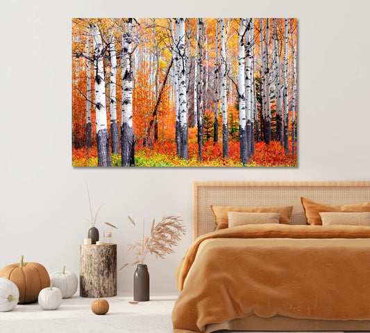
Bedroom calm without repainting
Think muted blossoms and sage leaves. Keep frames light oak or rattan for warmth. If your bedding is white, let the art be your color story.
Curated picks: vintage botanical posters

Antique Botanical Prints

Green Leaves Poster

Eucalyptus Line-Art Poster

Antique Lithograph Poster

Modern Abstract Flowers
Posters = easy framing; canvases = rich texture. Mix both for dimension.
Quick layout & size rules
- Over sofa: art width ≈ 66–75% of sofa width.
- Over console: leave 10–20 cm gap above the top.
- Bed headboard: bottom edge 20–25 cm above headboard; trio works best in 40×50 cm each.
- Grid gallery: 3–6 cm spacing between frames keeps it calm.
Frames, mats & finishes
To lean vintage without going stuffy, choose thin black, natural oak, bamboo/rattan, or brushed brass frames. Add an off-white mat (not stark white) around posters for air and contrast.
Canvas: matte & texture rich (cozy). Poster under glass: crisp & reflective (polished). Acrylic: glossy & modern (use sparingly with botanicals).
Mixing patterns the easy way
Think scale and story. Pair one expressive floral (hero) with two supporting patterns: stripes and checks, or simple line botanicals.
- Big floral + tiny stripe = classic balance.
- Two botanicals + one abstract = modern vintage.
- Keep palette to 4–5 shared colors across textiles and art.
Curated picks: calm sage + terracotta mix


Shortlist for narrow halls or above console tables.
Entry & bath micro-makeovers
Entries love personality—hang one botanical plate over a shaker peg rail with a woven basket below. In bathrooms, choose posters behind glass and add eucalyptus sprigs in a stoneware bud vase.
Two cozy gallery walls
Botanical Study Grid
- Six vintage plates in 30×40 cm, cream mats.
- Spacing: 4 cm; align tops and sides—like a herbarium.
- Color note: let one plate carry terracotta blossoms.
Terracotta Focal + Two Friends
- One hero canvas (60×90 cm) in terracotta tones.
- Flank with two 40×50 cm line-art leaves in black frames.
- Repeat terracotta in a throw/pillow nearby to “close the loop.”
Care & seasonal storage
- Keep canvases out of direct sun; dust with a soft, dry cloth.
- Store posters flat or rolled in tubes; avoid humidity.
- Swap seasonally: label backs with room + season for easy rotation.
More about materials and sizes on CetArt’s Canvas Print and Poster hubs.
FAQs
Choose canvas if you want matte texture and no glare; choose poster if you prefer a crisp, framed look (and easy glass cleaning in kitchens/baths).
Warm woods (oak, walnut) and brushed brass feel natural. Thin black frames add contrast in modern spaces.
Yes—use one bold abstract as the “accent” and let two botanicals ground the story. Share 2–3 colors across the set.
A 120–150 cm wide piece, or a trio around 3× (40×50 cm) with 4–6 cm spacing.
Target eye level: center at ~150 cm from the floor. Over furniture, keep 10–25 cm gap above the top.
No. Terracotta warms cool grays nicely—add a soft cream mat and a sage accent to bridge the temperatures.
Use posters behind glass or acrylic, keep them away from direct spray, and ventilate after showers.
One antique botanical, a small bowl for keys, and a terracotta pot. Add a runner and you’re done.
Absolutely—swap in two terracotta/botanical artworks and a ceramic vase. The wall color does the heavy lifting.
No. Aim for a shared palette and related subject (leaves/flowers). Mixed frames can work if two finishes repeat.
References & further reading
- Royal Botanic Gardens, Kew – features on plant art & history
- Smithsonian Libraries – Botany subject guide
- Pantone Fashion Color Trend Reports
- The Spruce – Terracotta decor ideas
- Apartment Therapy – Using vintage botanical prints
Explore more collections: Botanical Wall Canvas • Flowers Posters • Modern Wall Art.