Abstract Cracked Wall Effect — Raw Texture for Modern Interiors
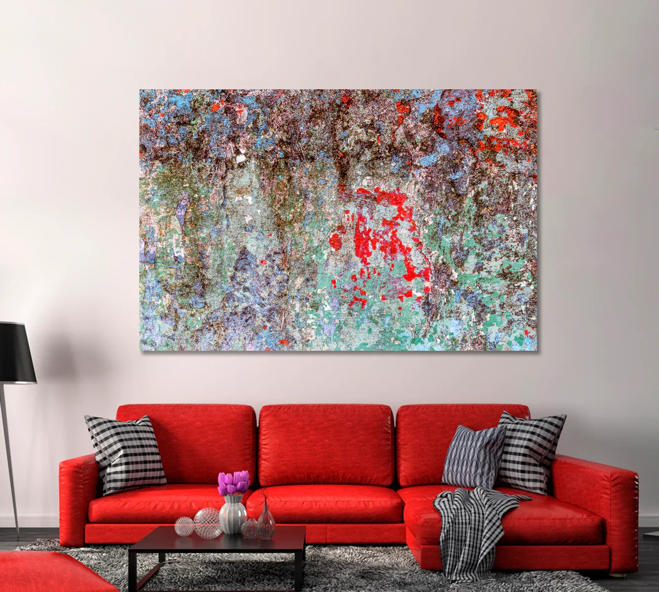
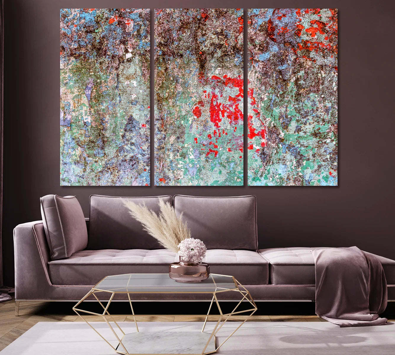
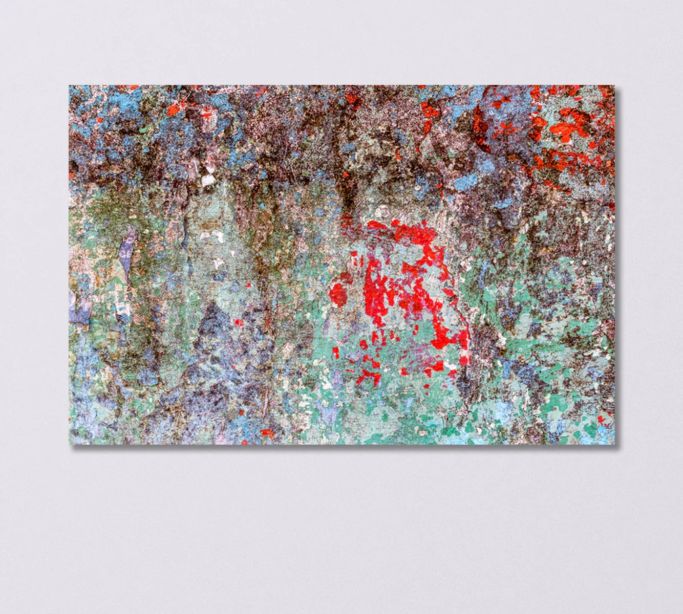
There’s a particular kind of beauty in timeworn surfaces: sun-baked pigment, mineral patina, and hairline fractures that map a history you can almost touch. Abstract Cracked Wall Effect captures that story—an expressive field of teal-green washes and weathered violets punctuated by ember-red accents. The result is a modern statement piece that instantly adds depth, movement, and character to clean, contemporary rooms.

Why Textured Abstracts Feel So Right Now
Today’s interiors favor contrast: smooth stone against woven textiles, soft boucle beside ribbed wood, matte paint next to a single glossy accent. Textured abstract art fits this rhythm perfectly. It adds a tactile, lived-in layer without clutter, bringing warmth and narrative to minimalist rooms. Abstract Cracked Wall Effect leans into that mood with a palette that balances serenity (sea-green, misty lilac, slate) and energy (strikes of ember red). The surface reads like weathered plaster—an homage to material honesty that designers love because it anchors a space and gives neutral furnishings something to “play” against.
Beyond aesthetics, this piece solves a practical challenge: large, uninterrupted walls—above a sofa, along a dining banquette, or in a high-ceiling hallway—often look flat. The painting’s organic movement breaks up that expanse, guiding the eye and creating a focal point that feels curated rather than staged. Whether you’re building a calm retreat or a boldly layered living room, this canvas delivers a grounded, gallery-level presence.
Because it pairs beautifully with a wide spectrum of woods, metals, and upholstery tones, Abstract Cracked Wall Effect acts as a styling connector. In cool rooms, it brings warmth through earthy patina; in warm rooms, its sea-green field introduces balance. If you want a piece that stills the room but never feels static, this is it.
Inside the Artwork: Materials, Finish & Quality
Premium canvas & pigment
Printed on heavyweight, gallery-grade canvas with high-fidelity inks, the image retains the subtle grain of weathered pigment and the crispness of those red flecks. The fabric tension and the depth of the wrap support a smooth, ripple-free face, so highlights and shadows track naturally across the artwork in daylight and evening illumination.
Gallery wrap for an elevated silhouette
Edges are neatly wrapped for a clean, ready-to-hang presentation. The profile sits proud of the wall, casting a soft shadow line that enhances the painting’s relief effect. Prefer an even bolder perimeter? Pair it with a floating frame to echo your hardware finishes—black, white, or warm wood.
Color story & mood
The palette is equal parts calm and electric: expansive teal-greens, lilac-violet undertones, and mineral browns that read like aged plaster. Across the surface, a constellation of red breaks adds a modern pulse. In rooms with stone, concrete, or limewash walls, the piece feels almost architectural—like a fragment from a beautifully worn facade.

Who This Canvas Is Perfect For
1) The Minimalist with an Edge
You love clean lines and neutral palettes but want a single, expressive gesture. This piece offers exactly that—quiet color fields energized by organic movement—so your room stays serene yet never sterile.
2) The Texture Lover
Your Pinterest boards are filled with plaster walls, limewash, and travertine. The painting’s tactile illusion complements boucle, linen, sisal rugs, and fluted cabinetry, tying finishes together without competing.
3) The Open-Plan Problem Solver
In airy living-dining spaces, you need anchors. Use this canvas over the sofa to define a conversation zone; repeat its emerald-teal in a vase or throw to create cohesion from room to room.
4) The Office Curator
If your home office faces a camera, the piece reads professional and artistic on video—a sophisticated backdrop that avoids reflections and moiré while adding depth and personality.
5) The Gift Giver with Modern Taste
For new homeowners, design-savvy couples, or anyone refreshing a space, this is a can’t-miss statement that suits varied styles from Scandinavian to contemporary rustic.
6) The Color-Confident Decorator
That ember-red splash loves company—pair it with a brick accent, terracotta planters, or a paprika pillow to pull its energy into the room.
7) The Gallery-Wall Mixer
Use a smaller size as a focal anchor within a mixed media gallery; its abstract texture bridges photography, line art, and typography with ease.
Gifting Ideas & Occasions
Art makes a memorable, long-lived gift. For housewarmings, a mid-size single panel fits most walls; for weddings and anniversaries, upgrade to a large format or a three-panel set for an immediately “finished” look above a sofa. Moving to a new city? A textured abstract like this brings instant warmth to a still-echoey space and pairs with transitional furniture while the home evolves.
For birthdays and promotions, consider how the recipient uses their space: larger statements in living rooms, quieter sizes for bedrooms, confidence-building pieces for a home office. If you’re gifting to parents or mentors, choose dimensions that respect existing furniture lines; for clients, select sizes that feel generous but versatile.
Seasonally, art shines during the winter holidays and spring refreshes alike. Include a thoughtful note about placement (“Hang ~two-thirds the width of the sofa”) and care (simple dusting) and—if timing is tight—send a printed card with the canvas image and a message that the art is “en route.” Many buyers also bundle gifts: a canvas plus a cozy throw in a matching sea-green, for example, or a vase in ember-red to echo the painting’s accents.
When to Buy for Maximum Impact
Large wall art is especially relevant in three moments: fall “nesting” season, holiday hosting, and spring refresh. In autumn, rooms trend cozier—textured abstracts deepen that character instantly. Ahead of holidays, a bold canvas tightens up a living room before guests arrive. And in spring, when we edit and lighten spaces, a mineral palette like this introduces calm without losing personality.
For planners, off-peak ordering ensures plenty of size options and smooth delivery. If you’re coordinating with paint or new furniture, order the art first to set the palette; it’s easier to match textiles and accent decor to artwork than the other way around.
Where It Belongs: Room-by-Room Styling
Living Room
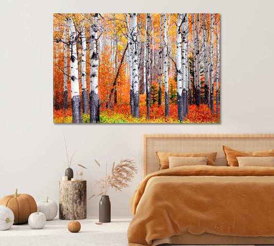
Center a 47×31" or 54×36" single panel over a standard three-seat sofa, or install the triptych to emphasize height in rooms with tall ceilings. Pair with charcoal or stone upholstery, sea-green cushions, and a single paprika accent to echo the artwork’s red.
Dining Area
Choose a wide format to mirror a rectangular table; the patina effect softens hard surfaces like glass and metal bases. Dimmer-friendly lighting will draw out subtle greens at dinner hour.
Bedroom
Over a queen or king headboard, pick a size that spans roughly two-thirds of the bed width. Use linen bedding in fog, dune, or mineral tones; add a terracotta throw for a quiet color echo.
Entry & Hallways
In narrow halls, a three-panel configuration introduces rhythm without dominating; in entries, a medium single panel above a console sets the tone for the entire home.
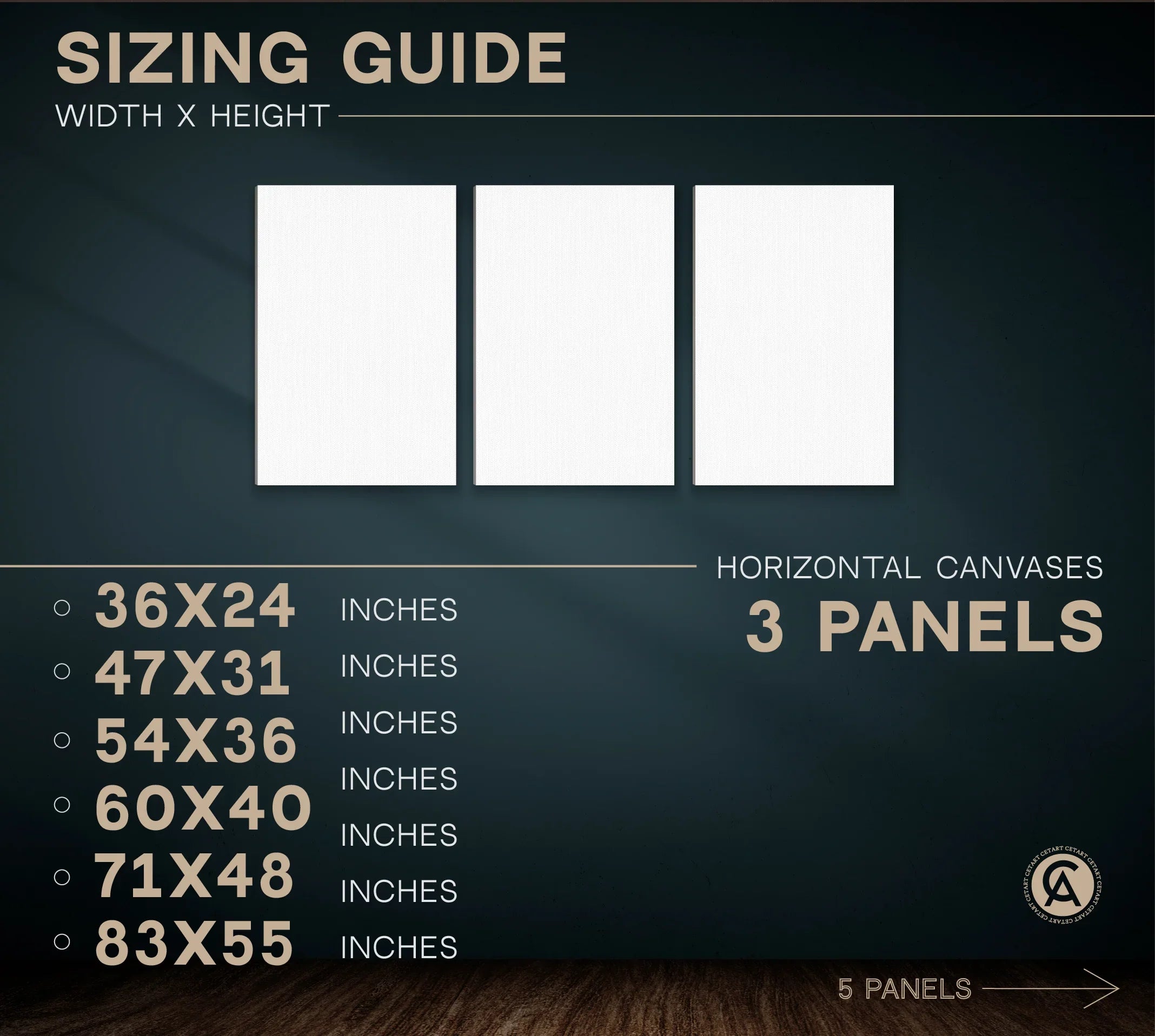
Quick Size Calculator
Enter your furniture width, and we’ll recommend the nearest canvas size from this product’s options.
Specifications & Options
- Formats: Single panel; 3-panel triptych; 5-panel set
- Popular single-panel sizes: 24×16", 36×24", 47×31", 54×36"
- Triptych sizes: 36×24" up to 83×55" (overall width depends on spacing)
- Five-panel sizes: 36×24" up to 83×55" (overall width depends on spacing)
- Finish: Gallery-wrapped canvas; optional floating frame
- Mounting: Ready to hang
You Might Also Like


Care, Maintenance & Longevity
Keep your canvas looking vivid by dusting gently with a soft, dry microfiber cloth. Avoid abrasive cleaners and prolonged direct moisture. If placing near bright windows, consider filtered light or sheer curtains to minimize UV exposure. For multi-panel sets, dust between panels during routine cleaning so the spacing remains crisp and shadow gaps stay even.
Mount on secure hardware, and check wall anchors periodically in high-traffic areas. With simple care, your piece will retain its depth and color for years, making it a dependable pillar of your room’s design language.
How This Canvas Stands Apart
Many abstract prints rely on flat color blocks; Abstract Cracked Wall Effect offers nuanced patina that reads like layered plaster, giving you material richness without the mess or permanence of a decorative wall finish. Compared with busy pattern art, its composition is expressive yet focused—so it complements furniture rather than competing with it. And versus photography, the painterly surface brings warmth and tactility that feel timeless even as your decor evolves.
Frequently Asked Questions
What size should I choose for over-sofa placement?
Is a frame required?
How do multi-panel sets affect the look?
Will the colors work with warm woods?
Can I hang it in bright rooms?
Is hardware included?
How do I clean the surface?
Can this work as a gift?
Design Reading We Love
Bring Character Home—In One Step
Abstract Cracked Wall Effect turns a blank wall into a story of time and texture. It’s modern but soulful, versatile yet unmistakable—equally at ease in a pared-back living room or a richly layered dining space. Choose the single panel for a bold, quiet statement; go multi-panel when the wall begs for breadth and rhythm. With thoughtful sizing, simple care, and finish options that suit your hardware and palette, this canvas is a reliable design anchor you’ll appreciate every day.
Images sourced from the product gallery. Keep URL parameters with ?v= tokens when embedding to ensure the correct asset version loads from Shopify’s CDN.