Spring 2025 Color Forecast: Blush, Sage & Sky in Wall Art
Soft pinks, herbaceous greens, and airy blues are the season’s easiest way to calm a room, brighten a mood, and make your walls do more with less.

Why Blush, Sage & Sky are having a moment
When life speeds up, homes ask for softer edges. Blush warms without shouting, sage reconnects us to nature, and sky blue clears visual noise. Together they create a fresh, restorative spring palette that flatters most finishes already in your space.
Emotional effect
- Blush: gentle romance; it softens angular furniture and concrete textures.
- Sage: a biophilic bridge that reduces “visual fatigue” and pairs well with stone, rattan, and oak.
- Sky: tidy clarity; cools warm rooms and brings coastal ease even far from shore.
“A good palette calms the eye first, then invites the hand.” — every happy wall stylist, ever.
Research & ideas worth knowing
Green-forward design connects to our innate love of nature (see the biophilic design patterns). Pink’s gentle energy is often read as soothing in color-psychology primers, and blue’s association with clear skies literally comes from light scattering in our atmosphere.
3 simple rules for mixing the trio (and loving the result)
- 60–30–10: Let one be the room’s base (walls, larger textiles), another be secondary (big art, rugs), and the last be accents (pillows, frames). Example: sky (60), sage (30), blush (10).
- Finish harmony: Blush loves warm metals (gold, bronze), sage loves natural textures (linen, oak), and sky loves matte blacks or brushed nickel.
- Two temperatures, one neutral: If two picks feel warm (blush, sage), add a cool neutral (stone gray). If two feel cool (sage, sky), add a warm neutral (beige, oat).
Where each color sings
Living room
Anchor with sky canvases over the sofa; thread in sage pillows and a blush throw.
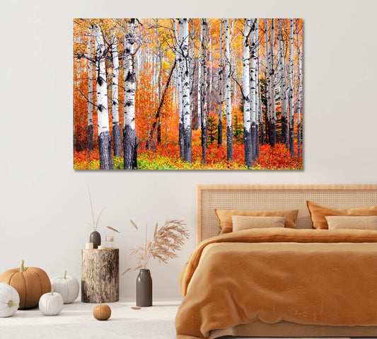
Bedroom
Place sage botanicals above the headboard; add blush abstracts on the nightstands, and keep sky tones in curtains.
Office
A single blush abstract softens screens; a small sky seascape gives “brain-clear” breaks.
Blush — 5 CetArt picks to warm a space


Want more? Browse the Abstract Modern and Botanical collections.
How to style blush without going “too sweet”
- Use one large piece (over sofa/bed) instead of many small ones—clean, grown-up, gallery feel.
- Surround with natural materials: oak, cane, linen. Add warm metal accents (brushed gold) on lamps or frames.
- Balance with cool notes (sky blue pillow, slate tray) to keep the palette modern.
For inspiration, peek at our quick guide on choosing textures in modern wall art that moves.
Sage — 5 CetArt picks to ground and refresh


Explore more green-forward art in our Botanical collection.
How to style sage for calm focus
Biophilic cues—leaves, branches, and natural textures—are linked with well-being and can foster gentle attention. That makes sage perfect for kitchens, studies, and entryways.
- Pair with matte ceramics and ribbed glass for tactile contrast.
- Use two botanicals flanking a mirror rather than a crowded collage.
- Layer linen blinds or a jute runner to echo the palette without extra color blocks.
Learn the “why” behind nature-centric rooms in 14 Patterns of Biophilic Design.
Sky — 5 CetArt picks to clear visual noise


Prefer posters? Explore our Posters for Room hub for affordable sky-blue sets.
How to style sky blue for calm clarity
Sky canvases feel bigger than their physical size because our brain reads horizons as “space.” It’s part science, part magic: short-wavelength light scatters in the atmosphere, making our sky appear blue. Use that calm psychology where you need focus and a visual deep breath.
- In small living rooms, choose a horizontal seascape to visually widen the wall.
- In work nooks, mix one blue abstract with a neutral cork board for rhythm without distraction.
- By windows, keep frames matte black or nickel so the view and the art don’t compete.
Curious why blue reads so special? See NASA’s explainer on why the sky is blue and a fascinating read on blue’s rarity in nature.
Sizing & placement that always looks intentional
Measure the furniture the artwork hovers over, then follow these quick benchmarks:
- Above a sofa/console: canvas width ≈ ⅔ to ¾ of the furniture width; bottom edge ~18–25 cm above.
- Above a queen bed: 90–120 cm wide single canvas, or two stacked 60×80 cm frames.
- Hallway/entry: choose vertical formats (triptych or single 60×90 cm) to elongate sightlines.
More placement ideas inside our canvas vs. framed walkthrough.
Frame & metal finish playbook
With Blush
Brushed gold or champagne frames; marble trays; boucle or linen upholstery. One warm wood accent table keeps it grounded.
With Sage
White oak, rattan, or beech frames; matte ceramics; lime-wash walls. Keep metals quiet: satin nickel over chrome.
With Sky
Matte black or light oak frames; ribbed glass and slate accents; striped textiles for a coastal note.
Care & longevity basics
Dust canvases with a soft, dry cloth; avoid direct sunlight and chemical cleaners. Rotate pieces seasonally to keep colors feeling fresh. For large installations, use two anchors and a level—future you will say thanks.
FAQs
What’s the easiest way to start with this palette?
Pick a base (walls or rug), then add one large canvas in your secondary color and a few accents in the third. Example: white walls, sky canvas, sage pillows, blush throw.
How do I keep blush from feeling too “cute”?
Use sophisticated materials—linen, stone, ribbed glass—and one bold contrast (matte black frame, charcoal lamp) to modernize it.
Which rooms love sage the most?
Kitchens, studies, entries, and bathrooms. It pairs naturally with woods and stone and lowers visual clutter.
Is sky blue too cool for cozy spaces?
Not if you ground it with warm neutrals (oat, beige) and add texture (wool, boucle). A single seascape can feel very inviting.
Best frame colors for each tone?
Blush → gold/champagne; Sage → white oak/beech; Sky → matte black or light oak.
How big should art be above my sofa?
Aim for ⅔–¾ the sofa width; hang the bottom edge ~18–25 cm above the back.
Canvas vs. framed prints—what’s right for me?
Canvas is ready-to-hang, edge-to-edge color with minimal glare. Framed prints add a border and more formal vibe—great near windows.
Can I mix all three colors on one gallery wall?
Yes—use a consistent frame style and keep one hue dominant. Align edges or use a common centerline for cohesion.