Arte mural de oficina • Enfoque ecológico • Productividad tranquila
Arte mural de oficina con enfoque ecológico: impresiones en lienzo botánicas y naturales que te mantienen en movimiento
Si tu espacio de trabajo se siente "ajetreado mentalmente", tus paredes pueden ayudarte... o sabotearte discretamente. Diseñemos un diseño de pared para la oficina que luzca bonito y fomente la concentración, usando arte verde, botánico y natural que transmita frescura (no como una sala de espera común).

Aquí está la trama: no estás decorando la pared de una oficina. Estás diseñando un entorno conductual . El arte adecuado puede hacer que tu cerebro respire hola, trabajo profundo. El arte inadecuado puede sentirse como 14 pestañas del navegador que no abriste... pero que, de alguna manera, todas reproducen música.
Esta guía se basa en una idea principal: verde + imágenes de la naturaleza = una "pista de enfoque" que invita a la calma. Iremos paso a paso: elige una paleta, selecciona los motivos, ajusta el tamaño, colócala sin reflejos y haz que se vea genial tanto en persona como por Zoom. A lo largo del camino, encontrarás reglas prácticas, algunos chistes amables y selecciones seleccionadas de CetArt cada pocas secciones para que puedas comprar con intención (sin entrar en pánico).
Por qué el verde funciona tan bien para las paredes de las oficinas
El verde es el equivalente visual de un amigo fiel que llega puntualmente y no te invita a volver un viernes a las 17:12. En interiores, el verde suele transmitir tranquilidad, equilibrio y vitalidad , y combina a la perfección tanto con maderas cálidas como con blancos modernos. Por eso, la decoración de oficina verde (especialmente el arte mural con motivos botánicos y paisajísticos) se ha convertido en una opción predilecta para oficinas en casa, estudios, clínicas e incluso espacios ejecutivos.
La idea principal es el diseño biofílico : incorporar las claves de la naturaleza a los espacios construidos. No necesitas una jungla en tu oficina (a menos que te encante rociar plantas). Un lienzo botánico o un paisaje forestal bien ubicado pueden ser un punto de partida ideal para tus ojos: algo que contemplar entre tareas sin despertar tu mente. Si deseas profundizar en los patrones de diseño biofílico, la descripción general de Terrapin Bright Green es un buen punto de partida ( 14 Patrones de Diseño Biofílico ).
El verde no tiene por qué significar solo fotos de plantas. Puede ser: siluetas de hojas (modernas y gráficas), abstractos de mármol esmeralda (lujosos y minimalistas) o escenas de agua y bosque (el "efecto ventana" que hace que las habitaciones pequeñas parezcan más grandes). Usaremos los tres —estratégicamente— para que tus paredes se vean cuidadas, no aleatorias.
Construye tu “paleta de enfoque” en 10 minutos
Antes de elegir la obra de arte, define la función que debe cumplir la pared. Tu paleta debe estar a la altura. Una paleta que se centra en la calma no sigue las tendencias, sino que complementa tus tareas.
| Ambiente de oficina | Los mejores verdes | Excelentes colores de apoyo | Mejores temas |
|---|---|---|---|
| Trabajo profundo (concentración silenciosa) | Salvia, eucalipto, esmeralda apagada | Blanco cálido, arena, carbón, roble natural. | Arte lineal botánico, abstracciones suaves, bosques. |
| Estudio creativo (energía de ideas) | Verde azulado, esmeralda de alto contraste | Azul marino, detalles en terracota, negro nítido. | Botánicos atrevidos, piezas surrealistas, temas divertidos. |
| Orientado al cliente (confianza + tranquilidad) | Verde clásico, oliva, tonos medios equilibrados. | Acentos de piedra, beige y latón. | Paisajes, escenas acuáticas, botánica minimalista. |
| Tecnológico/moderno (limpio y elegante) | Esmeralda + neutros fríos | Grafito, blanco, metálicos sutiles. | Abstractos de mármol verde con acentos espaciales y científicos |
Un punto más: tu paleta de colores también debe respetar la luz . Si tu oficina está orientada al norte y es fresca, elige verdes con un toque cálido (oliva, eucalipto). Si tu espacio recibe mucho sol, los tonos esmeralda más oscuros pueden verse intensos en lugar de apagados. Y si tus paredes ya son llamativas (pintura verde azulado, paneles oscuros), tus obras de arte pueden ser más tranquilas con composiciones más sencillas.
Motivos botánicos que se sienten modernos (no médicos)
El arte botánico tiene mala fama porque todos hemos visto la impresión de "hojas beige tristes" en lugares donde el tiempo se detiene. La solución es simple: opta por botánicos con formas definidas, espacio negativo limpio y colores definidos . Piensa en hojas de plátano, siluetas de agave, verdes tropicales: plantas con estructura.
Cómo elegir arte de pared botánico para la oficina que tenga un aspecto intencional
- Elige una forma destacada. Las hojas grandes o las frondas limpias dan un toque moderno; las flores pequeñas y recargadas pueden resultar recargadas.
- Mantén una paleta ordenada. Verde + neutro (o verde + un color de acento) tendrá un aspecto cuidado.
- Usa plantas para suavizar la tecnología. Si tu escritorio tiene pantallas y cables, las plantas en las obras de arte aportan calidez sin necesidad de mantenimiento.
- Mezcla lo real con lo abstracto. Combina un estampado de hojas con un sutil toque abstracto en verde para que no parezca un parque temático tropical.
Los botánicos también son una opción ideal para espacios compartidos: generalmente no son polarizantes, se ven frescos en cámara y funcionan en todos los estilos (escandinavo, moderno, bohemio e incluso de lujo discreto). Cuando estés listo para comprar, empieza con botánicos ideales para la oficina, con formas definidas y una composición limpia.

Impresión en lienzo de hojas de plátano
Comprar esta impresión
Impresión en lienzo de cactus de agave
Comprar esta impresión
Impresión en lienzo de hojas tropicales rojas y verdes
Comprar esta impresiónIdeal para: pared de escritorio • rincón de lectura • fondo tranquilo de Zoom
Compra la colección completa de arte mural para oficina →Verdes abstractos como “ruido blanco” visual
El arte abstracto es un truco para la productividad cuando se elige bien. Los mejores abstractos para oficina se comportan como "ruido blanco" visual: aportan profundidad e interés sin robar la atención. En verde, el arte abstracto puede transmitir la sensación de naturaleza, sin ser literal.
Si tu cerebro se sobreestimula con facilidad (¡hola, notificaciones!), los abstractos pueden ser más beneficiosos que las fotografías con muchos detalles. Le dan a tus ojos un punto de descanso entre tareas, lo que puede ayudarte a reiniciar sin agobiarte.
¿Qué hace que una “caja fuerte de oficina” abstracta sea?
- Contraste medio: profundidad suficiente para lucir premium, pero no tanta como para que se sienta caótico.
- Movimiento direccional: las ondas suaves o el jaspeado resultan relajantes; las formas afiladas e irregulares resultan enérgicas.
- Armonía de paleta: refleje un elemento en su habitación (color de la silla, alfombra, planta) para que el arte parezca “destinado a ser”.
Los resúmenes también son un salvavidas en las oficinas compartidas, ya que rara vez generan controversia. Reflejan el buen gusto sin decirle a la gente qué pensar. (Las paredes deberían respaldar los plazos, no iniciar debates).
Atrevido vs. silencioso: mantenerse profesional sin ser aburrido
"Profesional" no significa "estéril". Significa que la sala apoya el trabajo y respeta a las personas que lo realizan. La clave está en equilibrar elementos serenas (piezas serenas) con una declaración de seguridad (un estampado más llamativo).
He aquí una forma sencilla de verlo: el arte tranquilo calma el sistema nervioso ; el arte audaz revitaliza la identidad del espacio. Si todo es audaz, se genera ruido visual. Si todo está en silencio, la habitación puede parecer inacabada.
Una sencilla regla “60/30/10” para las paredes de la oficina
- 60% calma: botánicos, verdes suaves, composiciones minimalistas.
- 30% estructurado: abstracciones de mármol, equilibrio geométrico, contraste limpio.
- 10% acento lúdico: un tema de conversación (usado intencionalmente, no como un sobresalto).
Y sí: puedes ser juguetón. Puedes tener personalidad. Incluso puedes tener una jirafa con chaqueta. Eso sí, no pongas a la jirafa justo detrás de ti durante una llamada seria con un cliente a menos que confíes mucho en tu carisma.
Dimensionar las matemáticas para el arte sobre un escritorio
Elegir el tamaño de las obras de arte es el punto de inflexión de las buenas intenciones. Pero en realidad no es complicado: solo necesitas una fórmula. El objetivo es que las obras de arte se integren con los muebles, no que floten torpemente en el espacio.
| Ancho del escritorio | Ancho de arte recomendado | Mejor diseño |
|---|---|---|
| 40–48 pulgadas (escritorio pequeño) | 26–36 pulgadas | Un lienzo mediano o un par ajustado |
| 55–63 pulgadas (escritorio estándar) | 36–48 pulgadas | Una pieza de declaración o 2 o 3 piezas |
| 70–80+ pulgadas (escritorio/credenza amplio) | 48–60+ pulgadas | Lienzo de gran tamaño o pared de galería seleccionada |
Si tienes poco espacio en la pared (¡hola, vida de alquiler!), elige uno más alto que ancho: un lienzo vertical da una sensación de propósito y te ahorra tener muebles apretados. Y si estás decidiendo entre lienzo y póster, el resumen de CetArt te será útil para sopesar la textura, el acabado y la presencia general: Lienzo vs. Póster: diferencias, beneficios y cuál elegir .

Impresión en lienzo con ondas abstractas de mármol verde
Comprar esta impresión
Impresión en lienzo con ondas abstractas de color verde y naranja
Comprar esta impresión
Impresión en lienzo de mármol líquido abstracto
Comprar esta impresiónIdeal para: paredes con mucho trabajo • oficinas modernas • configuraciones minimalistas
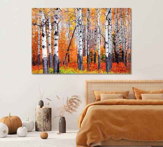
Compra la colección completa de arte mural para oficina →El efecto “ventana de la naturaleza”: bosques y agua
Si tu oficina se siente pequeña, plana o encajonada, los paisajes son una trampa. Un sendero forestal o un río pueden crear el efecto de "ventana natural": tu pared adquiere profundidad de repente. Y la profundidad es visualmente relajante, porque es lo opuesto al desorden.
Para enfocar, elige paisajes con una dirección focal clara (un sendero, la orilla de un río) y un caos limitado . Las cascadas pueden ser energizantes y relajantes si la composición es limpia. Las escenas forestales tienden a resultar restauradoras, especialmente cuando los verdes son equilibrados (sin neón).
Dónde funcionan mejor los paisajes
- Detrás de su escritorio: utilice escenas más tranquilas: verdes suaves, movimiento suave del agua.
- Frente a tu escritorio: busca la profundidad: un camino, un río, un horizonte.
- Rincón de reinicio: los paisajes ofrecen a tus ojos un “descanso de distancia” cuando te pones de pie.
Ubicación e iluminación: protección antideslumbrante para su pared
La forma más rápida de arruinar un bonito cuadro de pared de oficina es colgarlo donde refleje el resplandor, como si intentara hacer señales a los aviones. Buenas noticias: el resplandor es predecible.
Soluciones para el deslumbramiento que realmente funcionan
- Inclina la obra de arte ligeramente en dirección opuesta a la ventana principal (incluso unos pocos grados pueden ayudar).
- No te cuelgues directamente frente a una ventana si puedes evitarlo, especialmente si estás en una videollamada.
- Utilice una iluminación suave e indirecta (bañador de pared, lámpara de pie) en lugar de un foco intenso.
- Tenga cuidado con la altura del monitor: las obras de arte ubicadas demasiado bajas detrás de un escritorio a menudo captan reflejos de las pantallas.
Si desea una oficina completamente adulta, una simple lista de verificación ergonómica puede ayudarle a decidir dónde no debe colocar obras de arte (para mayor comodidad y mejor postura). La guía de estaciones de trabajo con computadora de OSHA es una referencia útil: OSHA eTool: Estaciones de trabajo con computadora .
Pared de galería vs. pieza llamativa (diseños de oficinas pequeñas)
En una oficina pequeña, normalmente hay dos estrategias ganadoras: una pieza llamativa (limpia y contundente) o una galería de pared compacta e intencionada . La peor estrategia es "imágenes pequeñas al azar esparcidas como confeti en la pared". (Si ese es tu caso: no te avergüences, hoy lo solucionamos).
Elige una pieza llamativa si…
- Quiere una actualización instantánea con el mínimo esfuerzo.
- Tu espacio ya cuenta con actividad visual (estanterías, monitores, equipos).
- Te gusta la calma y odias medir (válido).
Elige una pared de galería si…
- Tienes una pared en blanco más grande y quieres contar una historia visual.
- Quieres combinar elementos botánicos + abstractos + un acento lúdico.
- No tienes ningún problema en planificar (o sobornar a un amigo con un café).
Para una oficina tranquila y concentrada, los paisajes son excelentes anclas para cualquier distribución, ya que aportan profundidad y una sensación de amplitud a la habitación. Si tu decoración se inclina por el estilo costero o escandinavo, también te puede interesar esta lectura relacionada: Arte mural azul costero para salas de estar escandinavas . (El azul y el verde son una combinación clásica para lograr un enfoque cuando se combinan en tonos equilibrados).

Impresión en lienzo del bosque de bambú
Comprar esta impresión
Cascada Huay Mae Khamin en el bosque Kanchanaburi Lienzo
Comprar esta impresión
Impresión en lienzo del río turquesa de Islandia
Comprar esta impresiónIdeal para: oficinas pequeñas • espacios de atención al cliente • profundidad visual tranquila
Compra la colección completa de arte mural para oficina →El rincón del reinicio: arte que ayuda a los descansos (no a la procrastinación)
Una oficina productiva no es "trabajar sin parar". Es trabajar en buenos ciclos . Ahí es donde un rincón de reinicio ayuda: una pequeña zona visual que indica "pausa, respira, regresa".
En una oficina con enfoque ecológico, tu rincón de descanso puede ser: una pieza atrevida que inspire (espacio, surrealismo, diversión), combinada con un entorno tranquilo. Piensa en ello como un espresso creativo: pequeña dosis, gran impacto.
Las imágenes espaciales y científicas funcionan sorprendentemente bien aquí: añaden asombro sin ser demasiado personales. Si te interesan las imágenes de la Tierra y por qué son tan reconfortantes, el centro de imágenes de la Tierra de la NASA es una divertida madriguera: NASA Earth . (Advertencia: podrías salir dos horas después sabiendo mucho sobre las nubes).
Estrategia de pared con zoom: lo que se ve bien en la cámara
Si tu oficina también es tu lugar de reunión para Zoom, el arte mural debe cumplir dos funciones: verse bien en persona y verse bien en cámara. Las cámaras reducen el contraste y exageran el desorden, por lo que tu fondo necesita formas limpias y un color controlado .
Reglas para el arte apto para cámaras
- Elija una composición clara: un tema principal o un fuerte equilibrio geométrico.
- Evite los microdetalles: los patrones diminutos y recargados pueden brillar o verse ruidosos en el video.
- Utilice tonos medios: el arte muy oscuro puede verse como un rectángulo negro en la cámara web.
- Colóquelo ligeramente descentrado: el arte sobre un hombro luce intencional y mantiene su rostro como punto focal.
Los verdes botánicos son excelentes para Zoom porque suavizan los tonos de piel y dan una sensación natural. Los verdes abstractos también funcionan bien porque se leen como "textura", no como "material". Y si buscas un toque divertido, un solo estampado original puede hacerte memorable, en el buen sentido.
Oficinas compartidas: opciones artísticas por las que los equipos no se pelearán
Diseñar para una oficina compartida (coworking, clínica, estudio o espacio de trabajo) se basa menos en el gusto personal y más en la comodidad compartida . Se busca un arte que refleje el estado de ánimo y la identidad sin polarizar.
Categorías seguras pero no aburridas
- Botánica y paisajes: universalmente tranquilizadores, poca controversia.
- Resúmenes: moderno, flexible, fácil de combinar con la marca.
- Espacio/ciencia: inspirador y neutral, ideal para equipos tecnológicos y creativos.
Si su oficina compartida busca el bienestar y la tranquilidad, también puede explorar los recursos de WELL sobre diseño para el bienestar: International WELL Building Institute . No necesita una certificación para aplicar este espíritu: más elementos naturales, mejor iluminación, menos estrés.

Impresión en lienzo de estrellas y órbitas de macarrones con donuts espaciales
Comprar esta impresión
Impresión en lienzo de la Tierra y la Galaxia
Comprar esta impresión
Impresión en lienzo de astronauta en el espacio de fantasía
Comprar esta impresiónIdeal para: rincones de reinicio • estudios creativos • espacios de equipo modernos
Compra la colección completa de arte mural para oficina →Muro de personalidad: juguetona, segura de sí misma, todavía adulta.
Hablemos de la pared donde puedes ser un poco más "tú". No porque tu oficina necesite humor, sino porque la personalidad ayuda a que un espacio se sienta humano, y las personas trabajan mejor cuando se sienten con los pies en la tierra.
La clave es la intención. Una pieza lúdica es mejor cuando se lee como una elección cuidada, no como un meme aleatorio. Piensa en "extravagancia con estilo", no en "energía de residencia universitaria".
Cómo mantener el arte lúdico profesional
- Utilice una pieza central divertida y mantenga la decoración circundante simple.
- Elija arte con una composición premium (buen contraste, fondo limpio, sujeto fuerte).
- Elija temas que se ajusten a su rol: los trabajos creativos pueden ser más audaces; los roles con muchos clientes pueden preferir un toque sutil y extravagante.
Espacios de nicho: clínica, despacho de abogados, estudio, coworking
Cada espacio requiere diferentes señales emocionales. Aquí tienes recomendaciones rápidas y prácticas para "consultorios especializados" comunes (y sí, esta sección existe porque la gente busca cosas como "el mejor arte mural para el consultorio del terapeuta" a la 1:00 a. m.).
Consultorio/clínica del terapeuta
- Elija paisajes botánicos, forestales y acuáticos relajantes en tonos medios.
- Evite las imágenes agresivas y el caos de alto contraste.
- Mejor ubicación: frente a los asientos, ligeramente descentrado y con iluminación suave.
Despacho de abogados / finanzas / oficina ejecutiva
- Utilice abstracciones estructuradas (texturas de mármol, verdes profundos) para señalar estabilidad y sabor.
- Un paisaje puede suavizar el espacio sin socavar la autoridad.
- Combínalo con madera cálida, negro mate o detalles metálicos sutiles para lograr una sensación de “lujo tranquilo”.
Estudio creativo (diseño, marketing, contenidos)
- Utilice una base de color verde tranquilo y agregue una pieza decorativa divertida para darle energía a la marca.
- El arte espacial y surrealista funciona bien en “rincones de reinicio”.
- Bono: hace que tu fondo de filmación sea instantáneamente más interesante.
Coworking / oficina compartida
- Elija botánicos y abstractos neutrales y amigables; agregue personalidad con moderación.
- Considere “paredes de señalización” (una pared con un color más fuerte para anclar zonas).
- Mantenga las composiciones limpias para que el espacio se sienta mentalmente ordenado.
Lista de verificación para colgar + cuidado del lienzo
Has elegido el arte, estás emocionado, y ahora es el momento de la tarea final: colocarlo recto. La buena noticia es que solo necesitas unos pasos, y tu yo del futuro te lo agradecerá cada vez que levantes la vista a mitad de la tarea.
Lista de verificación de 5 minutos para colgar
- Primero, marque la línea central de su mueble (escritorio/credenza).
- Mida el ancho de la obra de arte y marque su centro en la pared.
- Utilice cinta de pintor para previsualizar la ubicación y retroceda entre 6 y 8 pies.
- Mantenga el borde inferior a unas 6 a 10 pulgadas por encima del escritorio (ajuste para los monitores).
- Nivelarlo (y volver a comprobarlo después del primer café de celebración).
Cuidado del lienzo (para que se mantenga hermoso)
- Evite la luz solar directa e intensa si es posible (puede desteñir las impresiones con el tiempo).
- Quite el polvo suavemente con un paño suave y seco (no utilice limpiadores químicos).
- Mantener alejado de zonas de fuerte humedad y fuentes de calor directo.

Impresión en lienzo de oficina con jirafa con chaqueta
Comprar esta impresión
Impresión en lienzo de un hombre de negocios mono
Comprar esta impresión
Impresión en lienzo de un hombre surrealista con una nube en lugar de cabeza
Comprar esta impresiónIdeal para: estudios creativos • oficinas personales • rincones de conversación
Compra la colección completa de arte mural para oficina →