
Textured Florals for Farmhouse Entryways: Canvas vs. Framed
A farmhouse entry doesn’t need much to feel warm — a console, a mirror, a basket for keys, and one beautiful floral artwork you can almost touch. In this guide, we compare canvas and framed floral pieces, explain how real or implied texture adds depth in small foyers, and share size, placement, and palette tricks that work every time.
What “Textured Florals” Really Means
Texture is the quality that makes art feel dimensional — brushstrokes that catch light, petals that read velvety, rough linen weave, or a printed surface that suggests depth. In farmhouse spaces, a bit of texture is gold: it counterbalances smooth paint, sleek mirrors, and ceramic vases, so the entry reads cozy instead of stark.


Browse more floral motifs in the Botanical Collection or explore sizes in our Sizing Guide.
Canvas vs. Framed: Which Suits a Farmhouse Entry?
Canvas Florals
- Warm & casual: No glass, fewer reflections, a natural fit with shiplap and wood.
- Lighter weight: Easier to hang in narrow entries and above slim consoles.
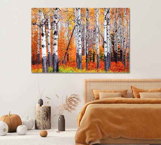
- Texture-forward: The surface reads tactile, enhancing the “welcome home” vibe.
Framed Florals
- Tailored finish: Wood or white frames add polish without losing farmhouse charm.
- Extra contrast: A thin frame line separates art from light walls for crisp definition.
- Glare factor: Glass can reflect; consider non-glare acrylic in bright foyers.
“Choose canvas when you want softness and depth; choose frames when you want definition and a dressed look.”
For an overview of pros and cons across rooms, see balanced comparisons such as Prodigi’s canvas vs. framed guide and Art.com’s overview.
Sizing & Placement Rules for Foyers
| Entry Width | Above Console | Standalone Wall | Height from Floor |
|---|---|---|---|
| 36–48 in (narrow) | Art width ≈ console width × 0.6–0.8 | 18–24 in wide piece | Center at ~57–60 in |
| 48–60 in | 24–36 in wide | 30–40 in wide | Center at ~58–60 in |
| 60–72 in | 36–48 in wide | 40–54 in wide | Center at ~60–62 in |


Need broader inspiration? See Modern Farmhouse Decor or the full Canvas Prints catalog.
Color Palettes: Creams, Sages & Blushes
Farmhouse entries favor softened, nature-forward palettes. Think linen whites, warm creams, sage green, wheat, and gentle blush. Textured florals in these hues echo dried stems, woven baskets, and raw woods, creating a familiar, handmade atmosphere.
Frame Choices: Woods, Whites & Distressing
If you go framed, look for slim profiles in oak, birch, or whitewashed wood. Distressed finishes nod to vintage furniture but keep the line narrow for a current look. Prefer canvas but want a finished edge? Consider a floating frame — it preserves texture while adding a crisp outline.
For selection ideas across foyers and other rooms, check comparisons like this room-by-room guide.


Styling with Consoles, Mirrors & Baskets
The best entry vignettes feel collected. Pair your floral with a wood console, a round mirror (to bounce light), a ceramic lamp, and a woven tray for keys. Vary heights: tall stems on one side, a stack of books on the other, art centered above.
“Odd numbers win.” Group in threes (lamp, stems, tray) and layer a small frame on the console in front of your main art.
One Statement vs. a Set
Narrow entry? One vertical piece reduces visual clutter. Wider wall? A diptych or triptych adds rhythm — just keep 2–3 inches between pieces. Canvas sets feel seamless; framed sets feel tailored. For maximum texture, mix one painterly piece with one photographic floral.
Light & Glare: What to Know at the Door
Foyers often get strong sidelight from transoms or adjacent windows. Canvas helps avoid glare; framed pieces benefit from non-glare glazing and a bit of angling. Keep art out of direct, harsh sun to protect pigments over time.
For real-life farmhouse entry ideas and floral use, browse inspiration like The Spruce’s entryway tips and seasonal dried-floral displays highlighted by Homes & Gardens.
Seasonal Swaps with Dried Florals
Let the art lead your seasonal styling. Pair blush peonies with fresh eucalyptus in spring, and trade for dried ammi, yarrow, or poppy pods in fall. The echo between wall art and stems makes even a tiny entry feel thoughtfully designed.
Care, Longevity & Budget
Canvas
- Dust with a soft, dry cloth; avoid sprays and harsh cleaners.
- Lightweight & budget-friendly at larger sizes.
- Great durability when kept out of direct sun.
Framed
- Dust frames; clean glazing with non-ammonia spray applied to cloth.
- Costs rise with frame & glazing, but protection improves.
- Choose non-glare acrylic if your door area is bright.
New to choosing wall art? A simple primer like this selection guide helps match style to space, while this botanical overview explains why florals stay timeless.
Quick Checklist & Common Mistakes
- Pick a palette (cream/sage/blush) and stick to it across art, stems, and textiles.
- Size to your console; leave 6–10 in of breathing room underneath.
- Canvas for soft depth; frame for tailored definition (or a floater for both).
- Mind glare from nearby windows; angle lamps away from glazing.
- Refresh seasonally with stems that echo your art’s colors and textures.


FAQs
Is canvas or framed better for a small farmhouse entryway?
Canvas is usually easier — it’s lighter, glare-free, and reads softer. If you need crisp edges, add a slim wood floater frame.
What size art works above a 40–48 inch console table?
A piece roughly 24–36 inches wide keeps proportions balanced. Leave 6–10 inches between the console and the art’s bottom edge.
How high should I hang entryway art?
Center at ~57–60 inches from the floor (or align with eye level of the tallest daily user if you have extra-tall ceilings).
Will framed pieces always glare near the door?
No. Use non-glare acrylic and avoid direct lamp or window reflections by angling light sources slightly away.
Which floral colors feel most “farmhouse”?
Cream, sage, eucalyptus, wheat, soft blush, and dusky rose tones pair beautifully with woods and woven textures.
Can I mix photographic florals with painterly canvases?
Yes — it’s a great way to layer textures. Keep a shared palette so the set looks intentional.
What if my entry is very narrow?
Use a vertical canvas (24×36 or 31×47) or a square 24×24 above a slender console. Mirrors help bounce light without crowding.
How do I clean and maintain my canvas?
Dust with a soft, dry cloth. Avoid sprays and direct sun. For framed pieces, clean glazing with non-ammonia spray applied to a cloth.