Map Prints for Travelers: Personalized City Poster Gallery Walls

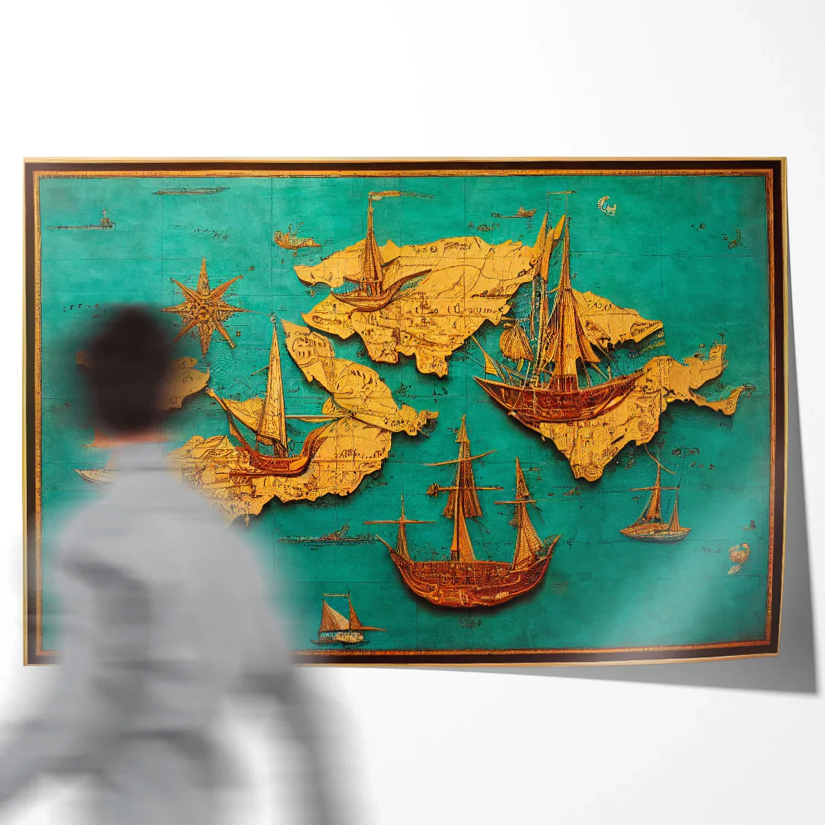
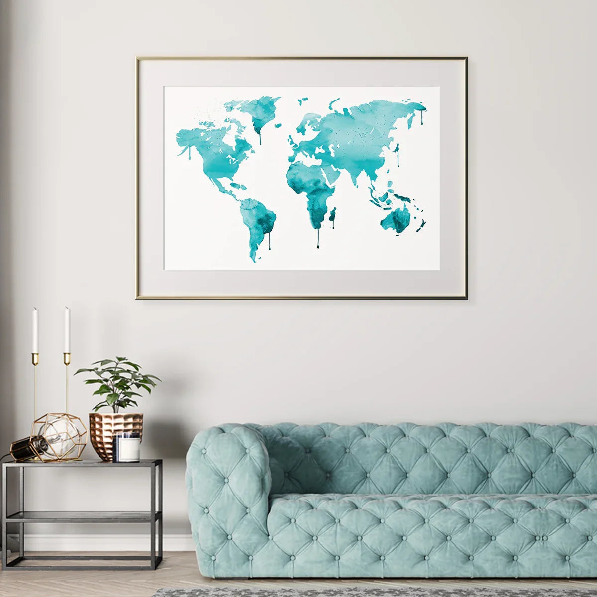
Hero: A vintage world map sets the tone for a travel-themed wall — great as an anchor piece.
If you love routes, skylines, and stories, a gallery wall built from maps and city posters is a perfect way to show where you’ve been — and where you’re headed.
Why Map Prints Work for Travel Lovers
Maps and city posters do two jobs at once: they decorate and they document. Each print anchors a memory — the trip where you learned to order coffee in a new language, the bridge you crossed, the street where you got the best dumplings.
Unlike generic art, cartography and skyline pieces hold clear places and dates. That clarity makes your wall both personal and easy for guests to read: one glance, and they know the chapter of your story.
Pick Your Cities with a Simple Framework
- Firsts: first solo trip, first marathon, first overseas study.
- Milestones: proposals, reunions, bucket-list hikes, festivals.
- Homebases: hometown, current city, places you’ve lived.
- Routes: favorite coast drive, classic rail line, island-hopping path.
Choose 5–9 pieces from those buckets. If you travel often, rotate prints seasonally and store extras flat in archival sleeves.
“The world is a book, and those who do not travel read only one page.” — (popular proverb)
Gallery-Wall Layouts that Always Look Sorted
Grid (balanced & clean)
Use same sizes in a tidy matrix. Works well with minimalist line maps and crisp city silhouettes.
Salon Mix (collected & lively)
Blend sizes and orientations around a clear center point. Keep spacing consistent to avoid visual drift.
Rail or Ledge
Line up 3–5 frames along a shelf. Great for rentals and for easy swaps after each new trip.
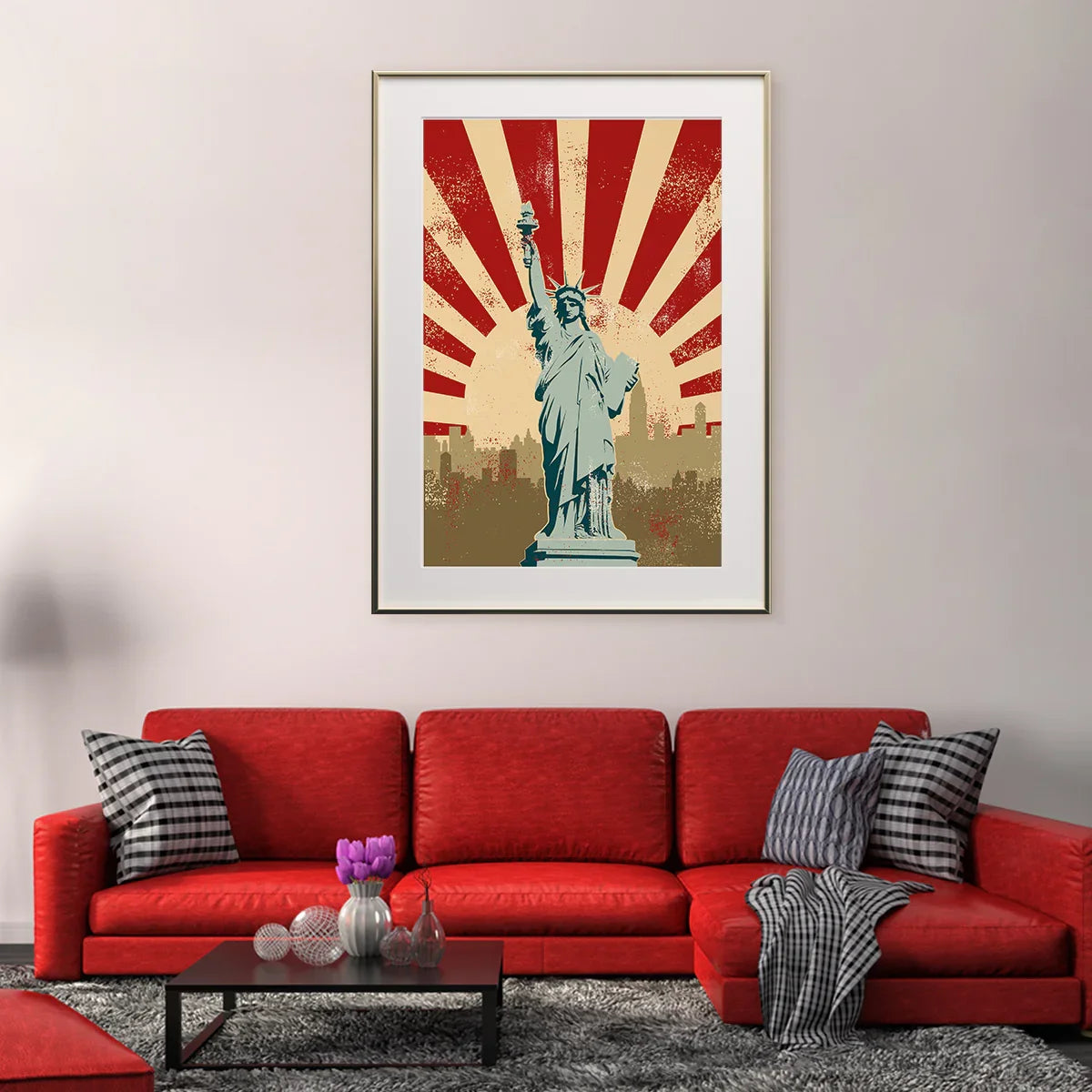
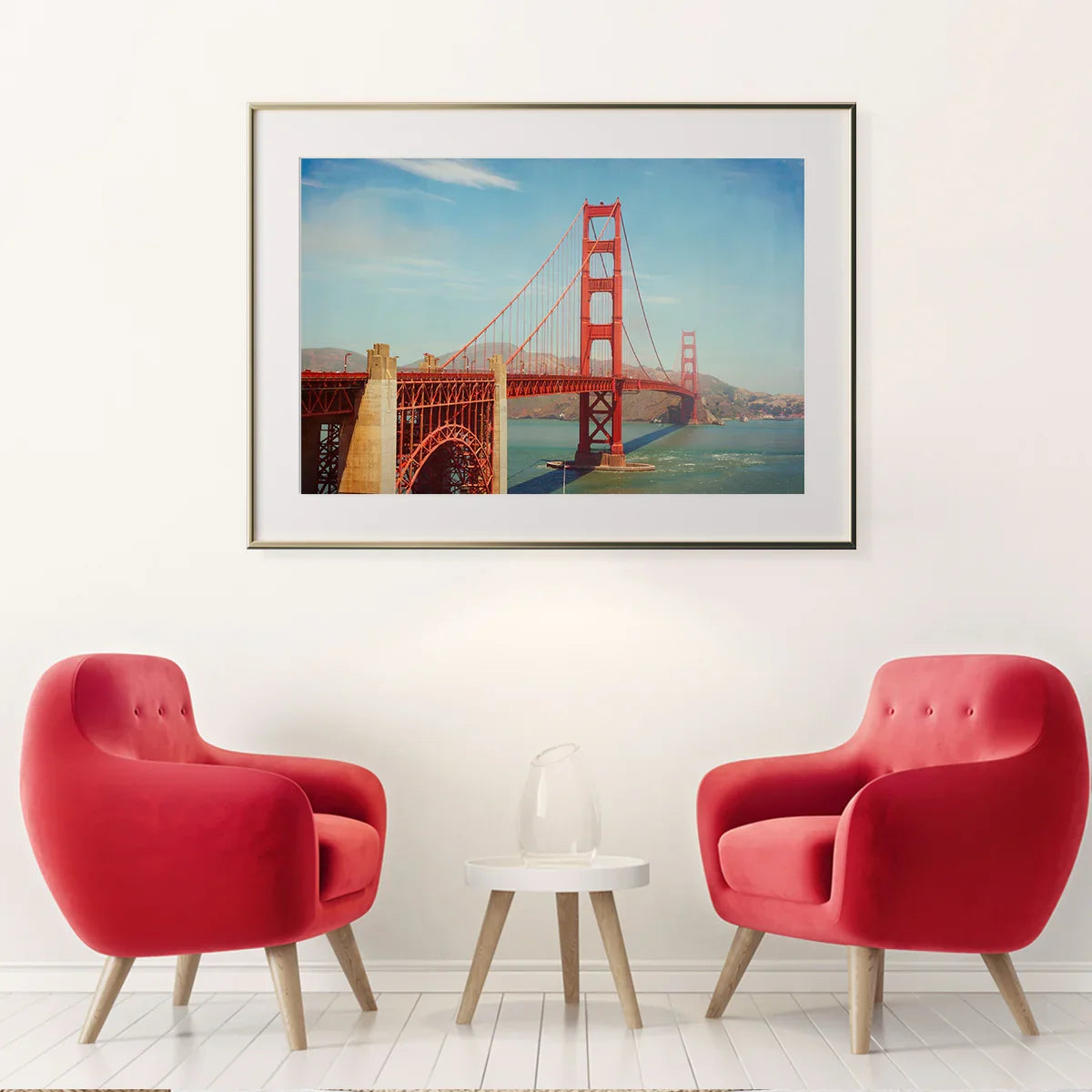
Traveler’s Map Starter Picks

Poster Styles & Vibes
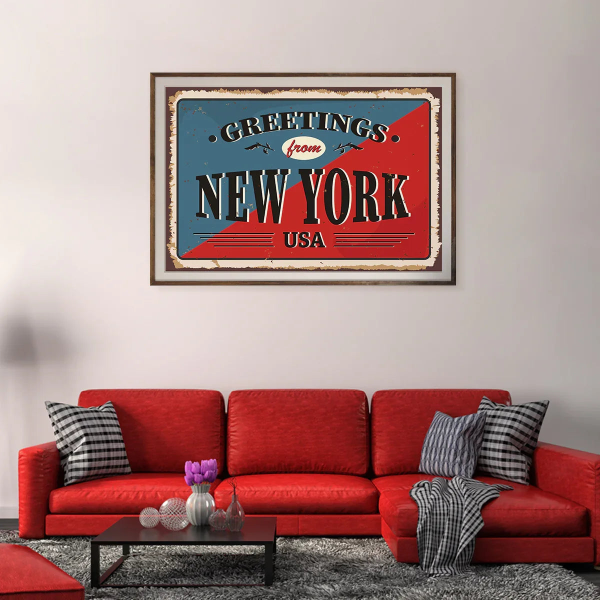
Vintage cartography: tea-tinted palettes, ornate borders, and compass roses suit cozy living rooms and home libraries.
Modern line maps: lean designs with clear roads and rivers fit minimal halls and workspaces.
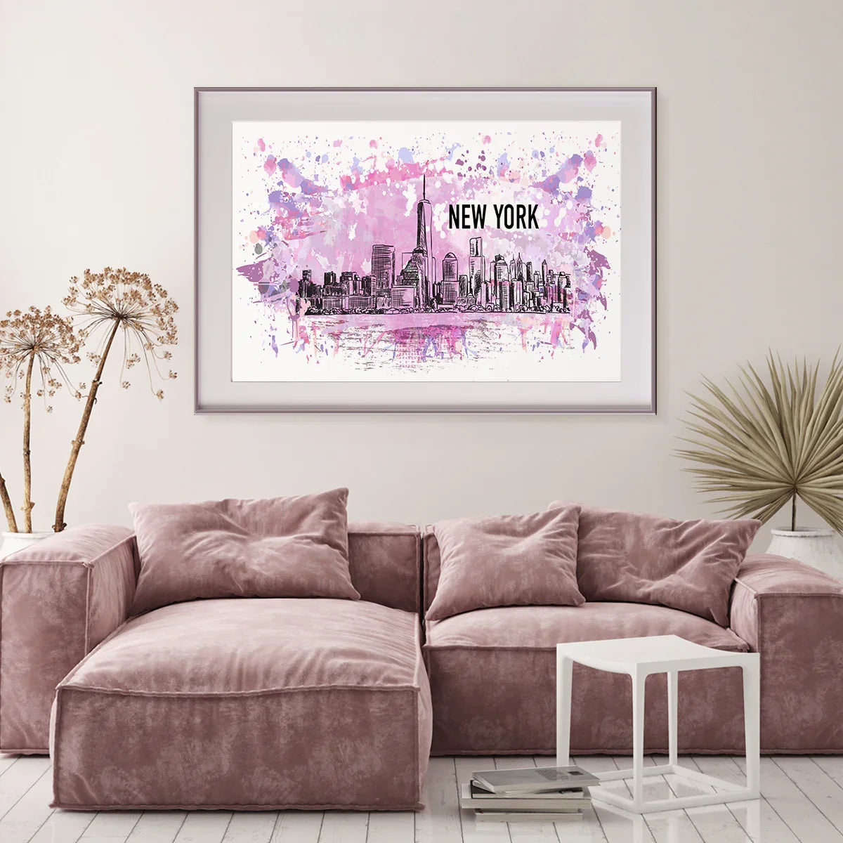
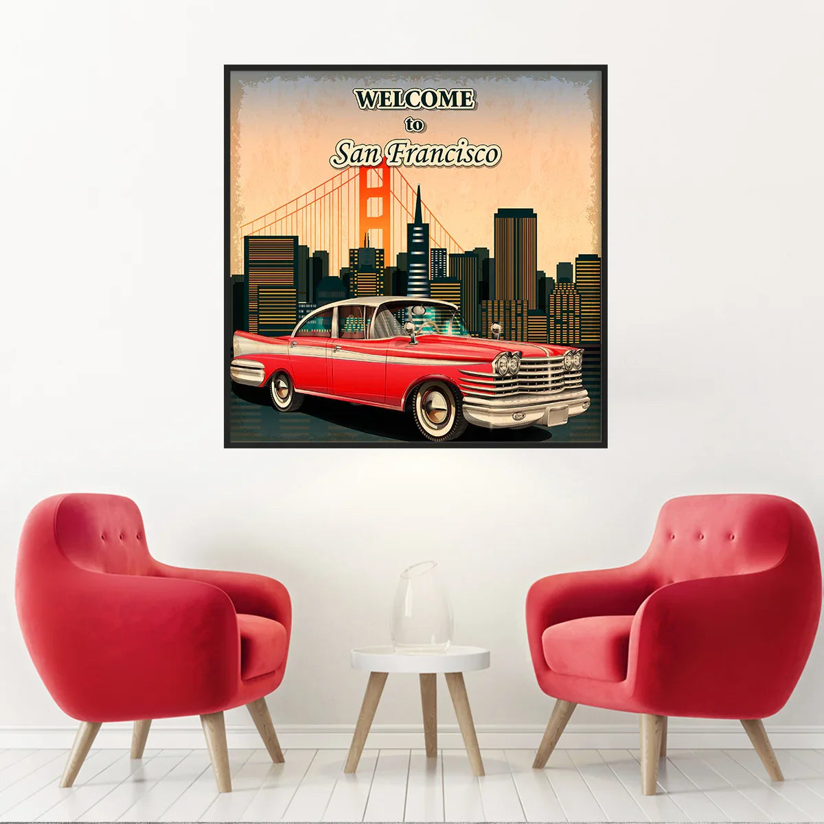
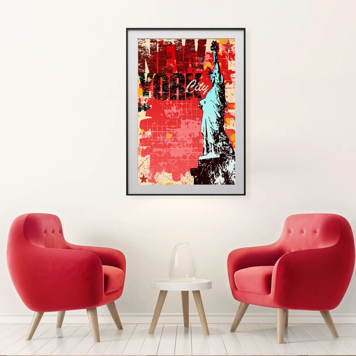
Pop-art city icons: bold color blocks, stylized landmarks, and playful type bring energy to media walls and teen rooms.
Color Strategy That Makes Posters Pop (without shouting)
Match one of your print’s accent colors to something already in the room: throw pillows, a rug stripe, a book spine. That small link makes the wall feel intentional.
For high-contrast city art, keep frames simple (black, white, or light wood). For vintage maps, warm wood or thin brass-tone frames look natural.
Sizes, Spacing & Ratios (so your wall looks organized)
Start with a center line at ~145–155 cm from the floor. Build your layout around that line, keeping gaps consistent.
| Space | Good Starting Size | Spacing Between Frames | Notes |
|---|---|---|---|
| Over sofa (3-seat) | 61×91 cm (24×36″) hero + two 40×50 cm | 5–8 cm | Keep total width ~⅔ of sofa width |
| Hallway | 30×40 cm in a linear set | 4–6 cm | Keep center line steady along the run |
| Home office | 50×70 cm grid of four | 4–5 cm | Square grids look tidy on Zoom |
| Entry | 40×50 cm + small 21×30 cm | 3–4 cm | Add a caption card or mini flag pin |
Tip: If you mix ISO paper sizes (A-series) with inch sizes, double-check mat openings. Learn more about A-series at ISO 216.
City Landmark Classics
Personalization Ideas (quick wins)
- Date ribbons: add a small label under each frame with trip dates.
- Route strings: thread thin cotton twine between frames to show paths.
- Pin marks: tiny map pins (on mats, not prints) for places visited.
- Captions: 1-line memory: “First sunrise on the Embarcadero.”
If you’re framing with mats, keep captions on the mat window bottom or in a small plaque below the frame.
Frames, Mats & Finishes
Black, white, and light oak frames handle most city posters. For vintage maps, try walnut or thin brass-tone frames. Use clear acrylic if your wall gets busy traffic; it’s lighter and safer than glass.
Neutral mats (white or off-white) help small prints read larger. Use 5–8 cm mats on 30×40 cm prints and 8–10 cm on 50×70 cm prints for a tidy reveal.
Best Rooms for Travel Gallery Walls
Living Room
Place the hero map over the sofa; flank with two city posters that share a color with your rug or throw.
Hallway
Try a timeline: oldest trip first, newest last. Equal spacing keeps it calm even with mixed frames.
Home Office
Use a 2×2 grid behind the desk. Pick city prints that spark good meeting stories (instant ice-breaker).
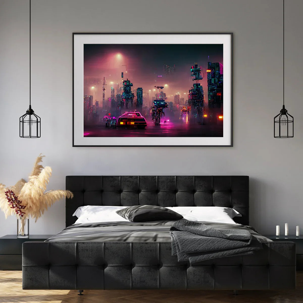
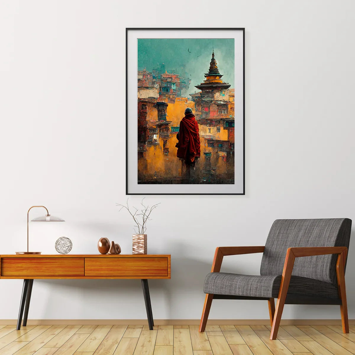
Pop-Art City Icons & Night Streets
Hanging Rules That Help (and save spackle)
- Center height: keep the middle of the grouping around typical eye level (~150 cm). Adjust for furniture height.
- Consistent gaps: 4–6 cm for small frames, 5–8 cm for medium/large.
- Two hooks per frame: reduces tilt and makes micro-adjustments easier.
- Test with painter’s tape: tape paper cutouts to the wall to preview.
Light & Glare Basics
Paper is sensitive to light over long periods. Use indirect light when possible and consider UV-filter acrylic if your wall gets strong sun.
For spotlights, aim fixtures at ~30° to reduce glare on glazing. Keep heat away from frames and avoid placing prints right above radiators.
Conservation guidance on light sensitivity is summarized by the AIC Conservation Wiki.
Care & Longevity
Handle prints with clean hands; avoid touching the image area. Store spares flat in archival sleeves with acid-free backing and interleaving sheets.
If you use mats, choose acid-free boards and tapes. Avoid spray adhesives. A short primer on paper care is available from the Library of Congress.
Budget Build vs. Premium Build
Budget
- Standard posters (30×40 cm to 50×70 cm), simple frames, no mats.
- Use a rail shelf to avoid many holes; swap prints seasonally.
Premium
- Hero map 60×90 cm+, mats at 8–10 cm, UV-filter acrylic.
- Custom captions, subtle pins, and accent lighting.
Step-by-Step: Build Your Personalized Travel Wall
- Choose a hero: world or country map that ties your trips together.
- Pick 4–7 cities: use the “Firsts / Milestones / Homebases / Routes” method.
- Layout on floor: set gaps and center line; snap a quick phone photo.
- Hang hero first: then work clockwise, keeping gaps consistent.
- Add captions: dates and one-line memories under or beside frames.
- Tune lighting: aim lights to reduce glare; dim to taste.
FAQs
How many prints should a travel wall include?
Five to nine is a sweet spot for most rooms. Use one hero map and add city posters around it with consistent spacing.
What size should I hang above a sofa?
A hero around 60×90 cm (24×36″) or a set that totals about two-thirds of the sofa width. Keep the center near eye level.
Do I need matching frames?
Not required. Matching frame color helps, even when sizes differ. Black/white/wood are versatile choices.
How do I avoid glare on glass or acrylic?
Aim lights at ~30°, avoid direct sun, and consider UV-filter acrylic. Reduce bright reflections opposite the wall.
Should I use mats?
Mats give breathing room and help small prints read larger. Use acid-free boards and leave an even border.
Can I mix vintage maps with modern city art?
Yes. Keep a common thread such as frame color or one shared accent color across pieces.
How do I label trips without writing on the print?
Add a small caption on the mat or a plaque below the frame. You can also keep labels on a rail shelf lip.
What paper care matters over time?
Use acid-free mats/backings and avoid long sun exposure. See the Library of Congress primer in the References.