Office wall art • green focus • calm productivity
Green Focus Office Wall Art: Botanical & Nature Canvas Prints That Keep You in Flow
If your workspace feels “busy in the head,” your walls can either help… or quietly sabotage you. Let’s build an office wall plan that looks beautiful and supports focus—using green, botanical, and nature-inspired art that feels fresh (not like a generic waiting room).

Here’s the plot: you’re not decorating an office wall. You’re designing a behavioral environment. The right art can make your brain exhale (hello, deep work). The wrong art can feel like 14 browser tabs you didn’t open… but somehow they’re all playing music.
This guide is built around one main idea: green + nature imagery = a “focus cue” that nudges calm attention. We’ll go step-by-step: choose a palette, pick motifs, size it correctly, place it for zero glare, and make it look great both in-person and on Zoom. Along the way, you’ll get practical rules, a few gentle jokes, and curated CetArt picks every few sections so you can shop with intent (not panic-scroll).
Why green works so well for office walls
Green is the visual equivalent of a steady friend who shows up on time and doesn’t ask you to “circle back” on a Friday at 5:12 PM. In interiors, green tends to read as restful, balanced, and life-giving—and it pairs nicely with both warm woods and modern whites. That’s why green office decor (especially botanical and landscape wall art) has become a go-to for home offices, studios, clinics, and even executive spaces.
The bigger idea is biophilic design: bringing nature’s cues into built spaces. You don’t need a jungle in your office (unless you truly love misting plants). A well-placed botanical canvas or forest landscape can act like a “soft landing” for your eyes—something to look at between tasks without triggering mental noise. If you want a deeper background on biophilic design patterns, Terrapin Bright Green’s overview is a solid starting point (14 Patterns of Biophilic Design).
Green doesn’t have to mean “plant photo only.” It can be: leaf silhouettes (modern and graphic), emerald marble abstracts (luxury and minimal), or water + forest scenes (the “window effect” that makes small rooms feel bigger). We’ll use all three—strategically—so your walls feel curated, not random.
Build your “focus palette” in 10 minutes
Before you pick the art, pick the job the wall should do. Your palette should match that job. A calm-focus palette doesn’t chase trends—it supports your tasks.
| Office vibe | Best greens | Great supporting colors | Best subjects |
|---|---|---|---|
| Deep work (quiet focus) | Sage, eucalyptus, muted emerald | Warm white, sand, charcoal, natural oak | Botanical line art, soft abstracts, forests |
| Creative studio (idea energy) | Teal-green, high-contrast emerald | Navy, terracotta accents, crisp black | Bold botanicals, surreal pieces, playful themes |
| Client-facing (trust + calm) | Classic green, olive, balanced mid-tones | Stone, beige, brass accents | Landscapes, water scenes, minimal botanicals |
| Tech/modern (clean + sharp) | Emerald + cool neutrals | Graphite, white, subtle metallics | Green marble abstracts, space/science accents |
One more thing: your palette should also respect light. If your office is north-facing and cool, choose greens with a touch of warmth (olive, eucalyptus). If your space gets strong sun, darker emeralds can look rich rather than washed out. And if your walls are already bold (teal paint, dark paneling), your art can go calmer with simpler compositions.
Botanical motifs that feel modern (not medical)
Botanical art gets a bad reputation because we’ve all seen the “sad beige leaf” print in places where time stands still. The fix is simple: go for botanicals with strong shapes, clean negative space, and confident color. Think banana leaves, agave silhouettes, tropical greens—plants with structure.
How to choose botanical office wall art that looks intentional
- Choose one hero shape. Big leaves or clean fronds read modern; tiny busy florals can feel fussy.
- Keep the palette disciplined. Green + neutral (or green + one accent color) will look curated.
- Use botanicals to “soften” hard tech. If your desk setup is screens + cables, plants in art add warmth without adding maintenance.
- Mix real + abstract. Pair a leaf print with a subtle green abstract so it doesn’t feel theme-park “TROPICAL!”
Botanicals are also a friendly choice for shared spaces: they’re generally non-polarizing, feel fresh on camera, and work across styles (Scandi, modern, boho, even quiet luxury). When you’re ready to shop, start with office-friendly botanicals that have clear forms and clean composition.

Banana Leaves Canvas Print
Shop this print
Agave Cactus Canvas Print
Shop this print
Red And Green Tropical Leaves Canvas Print
Shop this printBest for: desk wall • reading corner • calm Zoom background
Shop the full Office Wall Art collection →Abstract greens as visual “white noise”
Abstract art is a productivity cheat code when it’s chosen well. The best office abstracts behave like visual “white noise”: they add depth and interest without stealing attention. In green, abstract art can feel like nature—without being literal.
If your brain gets overstimulated easily (hello, notifications), abstracts can be kinder than highly detailed photography. They give your eyes somewhere to land between tasks, which can help you reset without grabbing you by the collar.
What makes an abstract “office-safe”?
- Medium contrast: enough depth to look premium, not so much that it feels chaotic.
- Directional movement: gentle waves or marbling feels soothing; sharp jagged shapes feel energetic.
- Palette harmony: echo one element in your room (chair color, rug, plant) so the art looks “meant to be.”
Abstracts are also a lifesaver in shared offices because they’re rarely controversial. They signal taste without telling people what to think. (Your walls should support deadlines, not start debates.)
Bold vs. quiet: staying professional without being boring
“Professional” doesn’t mean “sterile.” It means the room supports the work and respects the humans doing it. The trick is balancing quiet anchors (calm pieces) with one confident statement (a bolder print).
Here’s a simple way to think about it: quiet art calms the nervous system; bold art energizes the identity of the space. If everything is bold, you get visual noise. If everything is quiet, the room can feel unfinished.
A simple “60 / 30 / 10” rule for office walls
- 60% calm: botanicals, soft greens, minimal compositions.
- 30% structured: marble abstracts, geometric balance, clean contrast.
- 10% playful accent: a conversation piece (used intentionally, not like a jump-scare).
And yes: you can be playful. You can have personality. You can even have a giraffe in a jacket. Just don’t put the giraffe directly behind you during a serious client call unless you’re very confident in your charisma.
Sizing math for art above a desk
Choosing wall art size is where good intentions go to die. But it’s not actually complicated—you just need a formula. The goal is to make the art feel integrated with the furniture, not like it’s floating awkwardly in space.
| Desk width | Recommended art width | Best layout |
|---|---|---|
| 40–48 in (small desk) | 26–36 in | One medium canvas or a tight pair |
| 55–63 in (standard desk) | 36–48 in | One statement piece or 2–3 pieces |
| 70–80+ in (wide desk / credenza) | 48–60+ in | Large statement canvas or curated gallery wall |
If you’re working with limited wall space (hello, rental life), go taller rather than wider: a vertical canvas can feel intentional and save you from squeezing furniture. And if you’re deciding between canvas vs poster formats, CetArt’s overview is helpful when you’re weighing texture, finish, and overall presence: Canvas vs Poster: differences, benefits & which to choose.

Abstract Waves of Green Marble Canvas Print
Shop this print
Green Orange Abstract Flowing Waves Canvas Print
Shop this print
Abstract Liquid Marble Canvas Print
Shop this printBest for: deep work wall • modern office • minimalist setups
Shop the full Office Wall Art collection →The “nature window” effect: forests and water
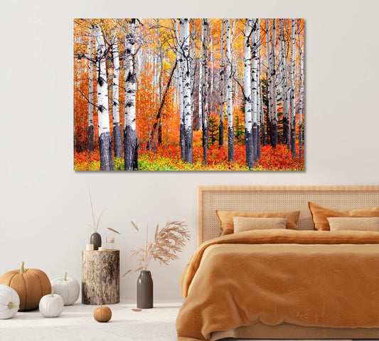
If your office feels small, flat, or boxed-in, landscapes are a cheat code. A forest path or a river can create the “nature window” effect: your wall suddenly has depth. And depth is visually calming—because it’s the opposite of clutter.
For focus, pick landscapes with: one clear focal direction (a path, a shoreline, a river edge) and limited chaos. Waterfalls can be energizing yet soothing if the composition is clean. Forest scenes tend to feel restorative, especially when greens are balanced (not neon).
Where landscapes work best
- Behind your desk: use calmer scenes—soft greens, gentle water movement.
- Across from your desk: go for depth—a path, a river, a horizon.
- Reset corner: landscapes give your eyes a “distance break” when you stand up.
Placement & lighting: glare-proofing your wall
The fastest way to ruin beautiful office wall art is to hang it where it catches glare like it’s trying to signal planes. Good news: glare is predictable.
Glare fixes that actually work
- Angle the art slightly away from the primary window (even a few degrees can help).
- Don’t hang directly opposite a window if you can avoid it—especially if you’re on video calls.
- Use soft, indirect lighting (wall washer, floor lamp bounce) instead of a harsh spotlight.
- Mind your monitor height: art too low behind a desk often catches reflections from screens.
If you want to go full “grown-up office,” a simple ergonomic checklist can help you decide where art should not go (for comfort and posture). OSHA’s computer workstation guide is a useful reference: OSHA eTool: Computer Workstations.
Gallery wall vs statement piece (small office layouts)
In a small office, you usually have two winning moves: one statement piece (clean and powerful), or a tight, intentional gallery wall. The worst move is “random small prints sprinkled like wall confetti.” (If that’s you: no shame—today we fix it.)
Choose a statement piece if…
- You want an instant upgrade with minimal effort.
- Your space already has visual activity (bookshelves, monitors, equipment).
- You like calm and hate measuring (valid).
Choose a gallery wall if…
- You have a larger blank wall and want visual storytelling.
- You want to combine botanicals + abstracts + one playful accent.
- You’re okay with planning (or bribing a friend with coffee).
For a calm-focus office, landscapes are excellent anchors for either layout—because they bring depth and a sense of “air” into the room. If your decor leans coastal or Scandi, you may also enjoy this related read: Coastal blue wall art for Scandinavian living rooms. (Blue + green is a classic focus pairing when used in balanced tones.)

Bamboo Forest Canvas Print
Shop this print
Huay Mae Khamin Waterfall in Forest Kanchanaburi Canvas Print
Shop this print
Iceland's Turquoise River Canvas Print
Shop this printBest for: small offices • client-facing spaces • calm visual depth
Shop the full Office Wall Art collection →The reset corner: art that helps breaks (not procrastination)
A productive office isn’t “work nonstop.” It’s work in good cycles. That’s where a reset corner helps: a small visual zone that signals “pause, breathe, return.”
In a green-focus office, your reset corner can be: one bold piece that feels inspiring (space, surreal, playful), paired with calm surroundings. Think of it as the creative espresso shot—small dose, big impact.
Space and science imagery works surprisingly well here: it adds wonder without being overly personal. If you’re curious about Earth visuals and why they’re so universally soothing, NASA’s Earth imagery hub is a fun rabbit hole: NASA Earth. (Rabbit hole warning: you may emerge two hours later knowing a lot about clouds.)
Zoom wall strategy: what looks good on camera
If your office is also your Zoom set, wall art should do two jobs: look good in person and read well on camera. Cameras flatten contrast and exaggerate clutter, so your background needs clean shapes and controlled color.
Camera-friendly art rules
- Choose clear composition: one main subject or strong geometric balance.
- Avoid micro-detail: tiny busy patterns can shimmer or look noisy on video.
- Use mid-tones: very dark art can look like a black rectangle on webcam.
- Place slightly off-center: art over one shoulder looks intentional and keeps your face as the focal point.
Green botanicals are excellent for Zoom because they soften skin tones and feel natural. Abstract greens also work well because they read as “texture,” not “stuff.” And if you want a playful twist, a single whimsical print can make you memorable—in a good way.
Shared offices: art choices teams won’t fight over
Designing for a shared office (coworking, clinic, studio team space) is less about personal taste and more about shared comfort. You want art that supports mood and identity without being polarizing.
Safe-but-not-boring categories
- Botanical and landscapes: universally calming, low controversy.
- Abstracts: modern, flexible, easy to match with branding.
- Space/science: inspiring and neutral—great for tech and creative teams.
If your shared office aims for wellness and calm, you can also explore WELL’s resources on designing for well-being: International WELL Building Institute. You don’t need a certification to apply the spirit—more nature cues, better lighting, less stress.

Space Donut Macaron Stars and Orbits Canvas Print
Shop this print
Earth and Galaxy Canvas Print
Shop this print
Astronaut in Fantasy Space Canvas Print
Shop this printBest for: reset corners • creative studios • modern team spaces
Shop the full Office Wall Art collection →Personality wall: playful, confident, still “adulting”
Let’s talk about the one wall where you can be a little more “you.” Not because your office needs comedy, but because personality helps a space feel human—and humans do better work when they feel grounded.
The key is intention. A playful piece is best when it reads as a curated choice, not a random meme. Think “stylish whimsy,” not “college dorm energy.”
How to keep playful art professional
- Use one playful focal piece and keep surrounding decor simple.
- Pick art with premium composition (good contrast, clean background, strong subject).
- Choose themes that fit your role: creative jobs can go bolder; client-heavy roles may prefer subtle whimsy.
Niche spaces: clinic, law office, studio, coworking
Different spaces need different emotional signals. Here are fast, practical recommendations for common “specialized offices” (and yes, this section exists because people really do search things like “best wall art for therapist office” at 1:00 AM).
Therapist office / clinic
- Choose calming botanicals, forests, and water scenes in mid-tones.
- Avoid aggressive imagery and high-contrast chaos.
- Best placement: across from seating, slightly off center, with soft lighting.
Law office / finance / executive office
- Use structured abstracts (marble textures, deep greens) to signal stability and taste.
- One landscape can soften the space without undermining authority.
- Pair with warm wood, matte black, or subtle metallic accents for a “quiet luxury” feel.
Creative studio (design, marketing, content)
- Use a calm-green base and add one playful accent piece for brand energy.
- Space and surreal art works well in “reset corners.”
- Bonus: it makes your filming background instantly more interesting.
Coworking / shared office
- Choose neutral-friendly botanicals + abstracts; sprinkle personality sparingly.
- Consider “wayfinding walls” (one wall with stronger color to anchor zones).
- Keep compositions clean so the space feels mentally tidy.
Hanging checklist + canvas care
You’ve chosen the art, you’re excited, and now it’s time for the final boss: hanging it straight. The good news is: you only need a few steps, and your future self will thank you every time you glance up mid-task.
5-minute hanging checklist
- Mark the centerline of your furniture (desk/credenza) first.
- Measure art width and mark its center on the wall.
- Use painter’s tape to preview placement and step back 6–8 feet.
- Keep the bottom edge ~6–10 inches above the desk (adjust for monitors).
- Level it (and re-check after the first celebratory coffee).
Canvas care (so it stays beautiful)
- Avoid direct harsh sunlight if possible (it can fade prints over time).
- Dust gently with a soft, dry cloth—no chemical cleaners.
- Keep away from heavy humidity zones and direct heat sources.

Giraffe in Jacket Office Canvas Print
Shop this print
Monkey Businessman Canvas Print
Shop this print
Surreal Man With Cloud Instead Head Canvas Print
Shop this printBest for: creative studios • personal offices • conversation corners
Shop the full Office Wall Art collection →FAQ
What size wall art should I hang above a desk?
How high should I hang art in a home office?
Is green a good color for office decor?
Should office wall art be framed or canvas?
How do I avoid glare on canvas prints in an office with windows?
What art looks best on Zoom backgrounds?
How do I create a gallery wall in a small office?
Can office wall art help reduce stress?
How do I clean and care for canvas prints?