Sea & Ocean Posters — Color, Motion, and Quiet Focus
Open water drawings, rippling patterns, and horizon lines bring a calm rhythm to rooms. In this guide, we explore CetArt’s Sea & Ocean Posters—how they’re printed, which sizes work near your furniture, who will love them, when they’re perfect for gifting, plus care and long-term tips.

1) Introduction & Context
Sea-inspired posters work because they combine structure and ease: measured line work suggests tide movement while soft gradients keep the room relaxed. The look suits modern living rooms with clean sofas, bedrooms that aim for low-light calm, and focused work corners that need a breath of space. From teal wave meshes to off-white spray, the palette spans ocean blues, seafoam, sand, and a hint of sunlight. That range makes it simple to match textiles you already own—throws, linen bed sets, woven rugs—without rebuilding the room.
Another reason these prints fit many homes is scale. You can choose a single tall poster to punctuate a narrow wall, a pair to frame a console, or a trio above a long sofa. When you keep frames slim and spacing even, the eye reads one coherent surface rather than competing elements. This guide breaks down materials, sizes, styling, and care—so you can pick once and enjoy for years.
“We dream in colors borrowed from the sea.” — a reminder to keep palettes honest and simple when you style coastal art.
2) Deep Dive into the Collection
Prints in this collection feature crisp vector curves, repeatable textures, and high-resolution edges that hold up at close view. Paper weight supports flat mounting inside standard frames; surface finish resists glare under everyday lighting. That means details in foam tracings, stippled spray, and subtle wave crests stay visible from sofa distance and at arm’s length.
Color handling favors layered blues—ultramarine, teal, and muted cyan—balanced with warm coral or sun-orange accents. Because hues are controlled rather than flashy, these posters play well with oak, walnut, white, and matte black frames. If you prefer a cooler read, try white or pale oak; if you want emphasis, matte black adds a clear outline.


Quality shows up in small choices: consistent border margins for easy framing, tonal transitions that avoid banding, and in-register line work so curves read smooth. Because the imagery relies on rhythm and contrast rather than busy detail, the prints stay readable across sizes—from small 30×40 cm accents to large 100×150 cm statements.
Quick Sizing Calculator
Enter your furniture width to see the nearest poster size. Tip: leave ~15–25 cm of air on each side for balance.
3) Ideal Buyers & Audience Profiles
The first-home stylist: wants one grounded element above a sofa to calm the room. A single poster at 60×90 cm gives scale without crowding. Slim black frame, centered 145–150 cm from floor to midpoint, keeps sightlines tidy.
The renter: values changeable looks. Two 50×70 cm prints hung 6–8 cm apart over a console create width and still move easily at lease end.
The bedroom minimalist: picks soft wave textures that read quiet at night. White or light-oak frames and matte paper reduce glare near bedside lamps.
The work-from-home pro: needs focus, not noise. A vertical wave study behind the webcam frames the face and adds a refined backdrop for calls.
The kids-room planner: chooses friendly shapes and simple color blocks; these prints deliver nature themes without clutter, pairing well with maps and alphabet art.
The gift buyer: prefers safe color and clean graphics. Ocean themes are widely liked, making them suitable for new apartments, newlyweds, or colleagues moving into a fresh office.
The collector: mixes formats. One tall poster plus two smaller pieces in an offset stack near bookshelves builds a personal wall that still feels orderly.
4) Gifting Opportunities & Occasions
Housewarming: choose a 50×70 cm piece in balanced blues—a size that fits most living rooms and hallways. Wrap flat in kraft with twine; include a tiny level and hooks for an all-set gift.
Weddings & anniversaries: opt for a pair—sun motif and wave motif—to symbolize partnership. Add a handwritten note about the couple’s shared outlook.
New jobs & promotions: a vertical print for the home office offers polish without distraction. Keep frames slim; neutral mats help on camera.
Birthdays: for teens and young adults, look for dynamic patterns; for calm-seeking friends, pick gentle ripple designs in mid-blue.
Encouragement: a small 30×40 cm poster by a reading chair or bedside can feel like a breath of sea air in tough weeks.
Corporate thanks: keep it neutral: wave studies in teal/white inside black frames. Add a short card from the team and a simple hanging kit.
5) Seasonal & Timing Considerations
Spring refresh calls for brighter blues and lighter frames. In summer, a sun-accent piece works near woven textures and indoor plants. Autumn benefits from deeper teal and off-white foam details that pair with wool throws. Winter rooms often need light—hang a print opposite a window to bounce brightness back into the space.
Planning ahead of peak holidays avoids last-minute framing stress. If you’re building a gallery wall, order key pieces first, map spacing with painter’s tape, then add smaller works over time.

6) Application & Styling Scenarios
Living room: for a 180–220 cm sofa, one 70×100 cm or 100×150 cm poster anchors the wall. Keep the bottom edge ~20–25 cm above the back cushion.
Bedroom: above a queen bed (160 cm wide), aim for 60×90 cm; above a king (180 cm), 70×100 cm reads balanced.
Office: a single vertical wave behind your chair offers structure for calls. Avoid heavy glare; place art slightly off the direct light path.
Dining: two 50×70 cm prints spaced 6–8 cm apart keep conversation flowing while adding interest.
Quick styling checklist
- Match frame tone to hardware (black, white, oak, or soft gold).
- Keep center height ~145 cm from the floor for consistent sightlines.
- Leave 15–25 cm side margin relative to furniture width.
- Group in odd numbers for small gallery arrangements.
7) Specifications & Options
- Common sizes: 30×40, 50×70, 60×90, 70×100, 100×150 cm.
- Aspect ratios: 3:4 (30×40, 60×80 equivalents) and poster-friendly 2:3 (50×75/60×90 family).
- Substrate: premium poster stock designed for sharp edges and stable color.
- Frames: slim black, white, oak, or soft gold; mats optional for a lighter read.
- Hanging hardware: D-rings/sawtooth; use two points for pieces ≥60 cm wide.
Selection tip: pick width at ~60% of the furniture below for a single piece; for pairs, each print can be ~40% of furniture width with 6–8 cm gap.

8) Care, Maintenance & Longevity
Dust frames and glass with a soft, dry cloth. For exposed posters, use a dry microfiber—no sprays. Keep out of direct sun where possible; if your wall gets long hours of light, consider UV-filter glazing. Avoid high humidity zones without ventilation. For moves, re-use corner protectors and pack flat with cardboard on both faces.
9) Competitive Positioning & Differentiation
Ocean posters often fall into two camps: noisy photo collages or flat single-tone shapes. This collection lands in the middle—clean graphics with enough texture to feel alive. The result is easy to place, easy to pair, and friendly to varied frames and wall colors.
10) Frequently Asked Questions
What size works above a 180 cm sofa?
Do I need a mat?
How high should I hang a pair?
Which frames suit ocean colors?
Can I build a small gallery wall?
How do I clean the surface?
Will these clash with patterned rugs?
What if my wall gets strong afternoon sun?
Is a single large poster better than two small ones?
How do I choose between blue tones?
Related Picks from the Collection
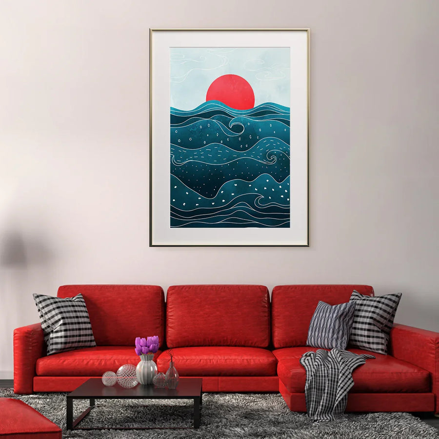
Red Sun & Waves — Bold Focal Poster

Abstract Wave Mesh — Calm Movement

Vintage Curl — Classic Coastal Linework
11) Conclusion & Next Steps
Sea & ocean posters bring color discipline and gentle motion to everyday rooms. With reliable paper, crisp edges, and sizes that map neatly to common furniture widths, this collection makes it straightforward to choose once and enjoy the view. Use the quick calculator above, match frame tone to your hardware, and keep placement consistent for a clean, restful wall.
Ready to refresh a wall with clear color and calm rhythm? Explore the Sea & Ocean Posters collection and build a look that feels effortless day after day.