Share
Dark Academia Framed Prints for Home Library Nooks
Candlelit wood, timeworn spines, and ink-deep palettes—Dark Academia is tailor-made for book lovers. Below, you’ll learn how to choose frames, mats, layouts, and lighting for framed prints that make even a tiny reading nook feel like a private study.

Dark Academia, defined
Dark Academia decor borrows the romance of old libraries and classical study—think deep browns and ink blacks, botanical diagrams, antique maps, Greek statuary, owls, violins, and the occasional candlelit still life. Frames and paper textures do as much heavy lifting as the image itself.
It reads classic, not kitsch: choose art that feels “collected” rather than themed. If you’re torn on where to start, prioritise poster art prints you can reframe later, then graduate to a few statement canvases.
Palette & materials
Anchor your nook with low-contrast, natural materials: walnut, ebonized oak, bronze, unlacquered brass, parchment ivory, oxblood, charcoal. Paper with a subtle cream cast looks more believable than bright white. Linen or suede mats soften hard book edges.
- Primary tones: umber, espresso, ink, brass, bone, moss.
- Accent tones: oxblood, bottle green, soot blue, antique gold leaf.
- Surfaces: open-grain woods, patinated metals, vellum-like paper, aged leather.
Frames, mats & glazing
For Dark Academia, pick slim walnut frames, flat black with a rubbed edge, or warm gilt with a touch of wear. Use 4–6 cm mats on small prints; 6–8 cm on larger pieces. Off-white (ivory) or museum-gray mats keep it scholarly.
Glazing matters: standard glass is fine in low light; consider UV-protective or anti-reflective glazing opposite windows. Canvases can hang unglazed for a period feel.
Gallery layouts for tight nooks
Small libraries excel with vertical storytelling. Stack three frames top-to-bottom beside the shelves; or run a five-piece salon grid above a reading chair. Keep gaps tight (2–4 cm) so the whole reads as one visual field.
Rule of thumb: align either tops, middles, or bottoms—not all three. Your eye wants a spine to follow, just like a bookshelf.
Sizing by sightline
Measure the viewing distance (in meters), multiply by 0.4 for the minimum diagonal length of your focal piece. From an armchair 1.8 m away, aim for a ~70–80 cm diagonal. Layer smaller frames around it.
Lighting without glare
Use warm (2700–3000 K) lamps with opaque shades placed just off-axis so bulbs don’t reflect in glazing. Picture lights look classic, but a shaded floor lamp often gives better reading light.
Opposite a window? Angle frames by 5–7° down or choose anti-reflective glazing. Canvas prints sidestep reflections entirely.
Designing micro-nooks
Working with 90 cm of wall? Go vertical: one 50×70 cm portrait print above a slim side table, then tuck a small botanical inside the bookcase to echo it. If your nook is under stairs, use a darker paint behind the frames to deepen the alcove.
Shelves: art behind books
Lean a small framed print behind a stack of hardbacks; slide a miniature bust in front to create depth. Inside shelves, choose matte glazing or canvas to dodge reflections from cabinet lights.
Rotate seasonally: mushrooms and forest prints for autumn; maps and constellations for winter; botanicals in spring; city manuscripts in summer. See more ideas in Botanical Posters and Map Posters.
Textures, props & scent
Rough linen throws, waxed leather bookmarks, brass clips—these tactile “quiet luxuries” make prints feel at home. Keep a candle (resin, cedar, or pepper) to scent the moment you open a book.
- Layer a violin or typewriter (if you have one) beneath a still-life print.
- Use a dark tray to corral spectacles, fountain pens, and matches.
- Let one gilded frame sit among four walnut frames for hierarchy.
Mixing maps, botanicals & portraits
Think like a curator: pair one figurative portrait (Greek bust or profile) with one botanically precise print and one cartographic piece. The trio tells a story—people, nature, place—that feels authentically academic.
To keep harmony, repeat at least one element across your trio: same mat color, same frame finish, or same paper tone.
Budget strategies (that still look luxe)
- Start with posters for flexibility; upgrade a favorite into a canvas later. Explore the full Posters hub.
- Choose ready-made frames in walnut or black; have a framer cut a custom mat (it’s the mat that makes it “gallery”).
- Hang in odd numbers (3–5–7) and keep gaps consistent—elevates even affordable pieces.
- Shop a focused subject set—books, maps, owls—so your wall feels collected, not random.
Care & longevity
Keep framed works out of direct sun and away from heat sources. Dust frames with a soft brush; for glass, use a microfiber cloth and a spritz applied to the cloth (not the glazing). Canvases prefer a feather duster only.
When storing, interleave acid-free paper between stacked frames. If you rotate seasonal art, label the back with hanging notes so reinstall is painless.
Three copy-and-paste room recipes
Compact armchair corner
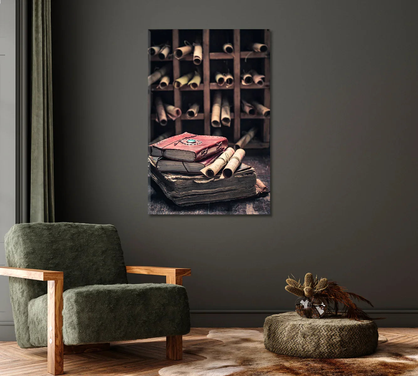
- Above the chair: Antique Books & Scrolls at ~60–70 cm wide.
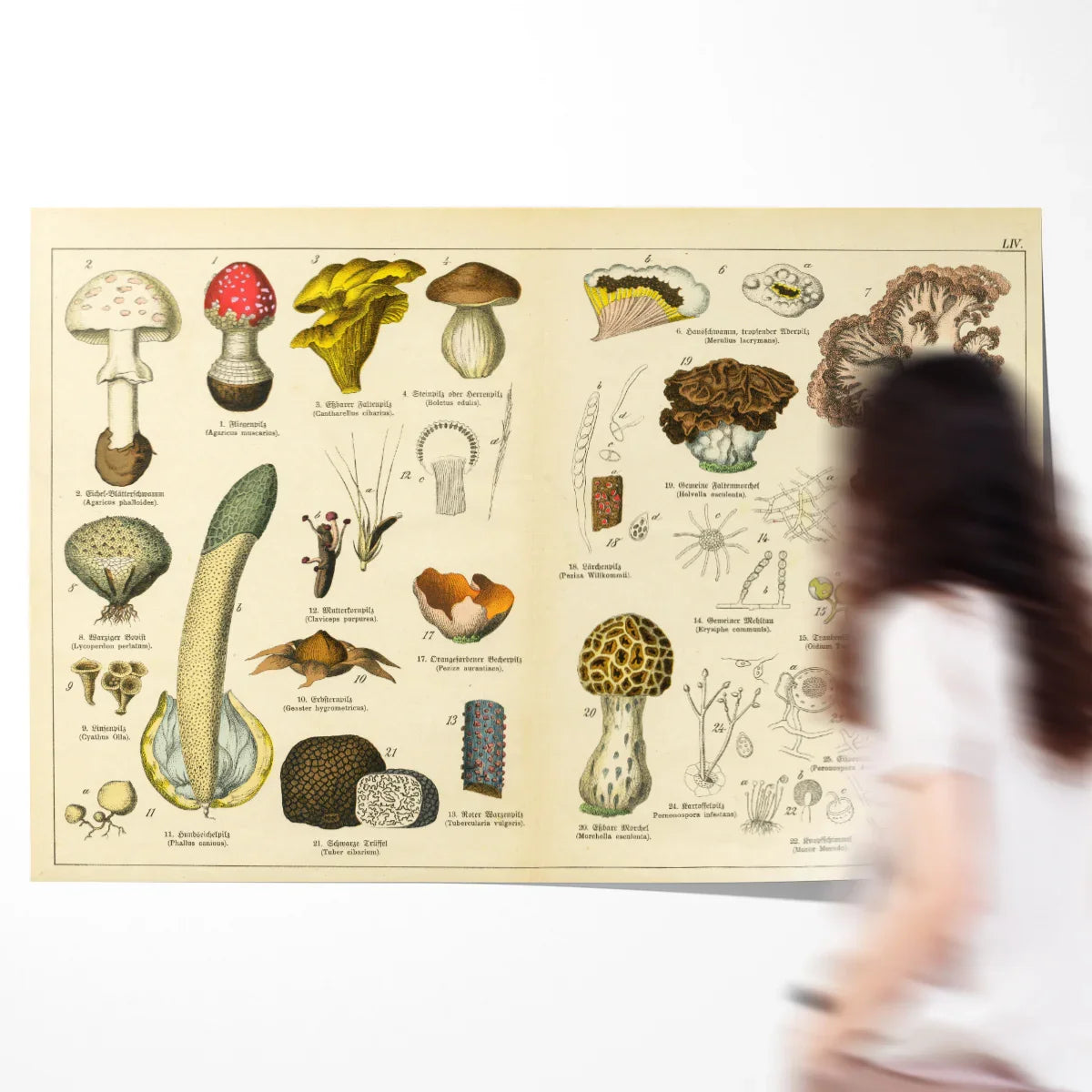
- Right side vertical: Vintage Mushrooms (A2) over Old Map with Ships (A3).
- Lamp: warm fabric shade, placed slightly forward of the frames.
Bookcase nook with console
- Console anchor: Trinity College Library ~90–100 cm wide.
- Leaning accents: Greek Minimalist Portrait + small botanical leaned inside shelves.
- Finish: one gilt frame among three walnut frames for hierarchy.
Salon wall over daybed
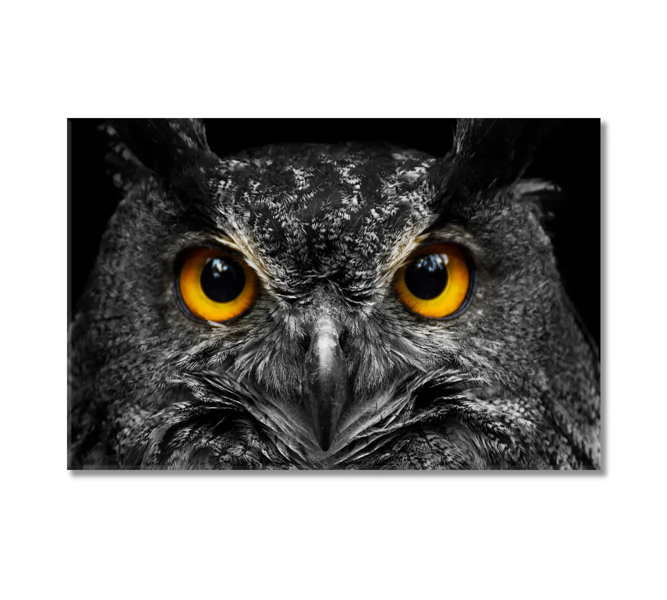
- Center: Owl in Black & White canvas, 80–100 cm wide.
- Flankers: Vintage Old World Map + Greek Goddess.
- Bottom row: two 30×40 cm prints from Botanical Posters for rhythm.
FAQs
What makes a print feel “Dark Academia” rather than just vintage?
Subject (libraries, maps, botanicals, classical portraits), restrained palettes, and frames with history—walnut, ebonized, or gently gilt—shift the vibe from retro to academic.
Should I choose posters or canvas for a reading nook?
Posters excel for gallery walls and budget flexibility; canvas helps in low-light spaces where glazing glare could distract.
What mat color looks most authentic?
Ivory or museum gray. Bright white can feel too contemporary for this style.
How high should I hang above a chair?
Center the artwork roughly at seated eye level (105–120 cm from floor to frame center), or align the bottom edge ~20–25 cm above the chair back.
Can I mix gilded frames with black frames?
Yes—use gilded as an accent (1 in 4 or 1 in 5) so it reads as a highlight, not the default.
How do I avoid glare on glass?
Place lights off-axis, angle frames slightly downward, or use anti-reflective glazing. Canvas avoids reflections entirely.
Do mushrooms, maps, and statues really work together?
They do—together they tell a story of nature, place, and culture, which is the core of the academic mood.
What’s a quick 3-piece starter set?
Additional inspiration: browse Posters and Black & White Wall Art.
