Japandi Bedroom Calm: Neutral Line-Art Posters That Soothe
Soft lines, warm neutrals, simple rhythm — quiet art for deep rest.

What Japandi means for bedrooms
Japandi blends Japanese wabi-sabi and Scandinavian comfort. The goal is a room that feels useful, natural, and calm. Surfaces breathe. Lines are simple. You keep the things that matter and skip the rest.
Neutral line-art posters fit this idea. A single ink outline can speak softly while still giving the wall a clear point of view. Keep shapes simple, and let negative space do the heavy lifting.
“Leave enough empty space so the room can exhale.”
If you’re new to the style, begin with one wall and one poster. Watch how the room feels, then add slowly.
Why neutral line-art tames visual noise
Line-art strips detail down to its outline, which your eyes read quickly. Fewer edges mean less mental load. That matters in a room meant for deep rest.
Neutral palettes — warm whites, sand, mushroom, clay, black, charcoal — help artwork blend into furniture and textiles instead of competing with them.
A quiet palette that still feels warm
Think warm white walls, pale oak or ash furniture, black accents in small doses, and artwork that sits between them. Beige-tinted papers and off-white mats keep the look soft.
Reliable pairs
- Ink black + warm white poster paper
- Charcoal line + oatmeal paper tone
- Sepia line + clay or sand mat
Neutral line-art picks for a calm start
 Abstract Leaf Line Art (B/W)
  Abstract Branch Line Art (B/W) Leaf Line Art (B/W)
  Leaf Wall Art Abstract
  Foliage Line Art + Watercolor
Prefer a broader browse? See the full Line-Art Posters collection.
Textures, finishes, and how posters join the mix
Japandi rooms feel grounded because finishes are honest: wood looks like wood, metal looks like metal, fabric feels like fabric. Posters can match that honesty with matte paper and simple frames.
Paper & print
- Matte poster paper keeps glare low.
- Off-white base papers read softer than bright white under warm lamps.
- Deep blacks matter: clean lines need crisp ink.
Where posters sit among textures
Against slub linen or a nubby throw, a clean line gives the eye a place to rest. Keep wood tones light or mid — oak, ash, beech — and save very dark wood for tiny accents.
Poster sizing: quick rules that work
For above-bed art, aim for 60–80% of bed width across the full arrangement. Two or three posters usually feel balanced in a bedroom.
Handy size helper
Above-bed layouts that look calm, not crowded
Single large poster
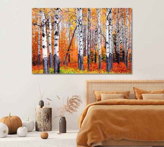
Use one big line-art piece centered over the headboard. Hang the bottom edge 15–25 cm above the headboard so bedding and art feel connected.
Calm triptych
Three equal posters with 3–4 cm gaps make a steady rhythm. Pick one subject family (leaves, seeds, branches) for consistency.
Nightstand vignettes with tiny line-art
Small frames (e.g., 13×18 cm) add a gentle moment near a lamp or a vase. Keep counts low: one small frame is often enough, two at most.
Pick a subject that matches the larger posters: if the wall shows leaves, the nightstand can carry a single twig drawing or a seed head.
Frames & mats that whisper, not shout
Good frame choices
- Natural wood (oak, ash, beech) with a slim profile
- Black frame in a fine line, used sparingly to repeat ink lines
- Off-white mat to soften contrast
Avoid shiny frames; low-sheen finishes keep things calm under warm lamps.
Light that makes ink lines feel soft
Use warm bulbs around 2700–3000K. Aim for layered light: one ceiling source, one wall or floor lamp, and one bedside lamp. Dimmer switches help the paper tone look gentle at night.
Angle a wall lamp so it grazes the poster surface — you’ll see texture without glare.
Seasonal swaps without clutter
Keep one spare poster in a tube for a quiet change of mood: light seed heads in spring, gentle branches in winter. Store the extra in a flat folder or the shipping tube behind the closet door.
Swapping one piece each season refreshes the room without buying a whole new set.
Common mistakes (and easy fixes)
- Frames too shiny: pick matte or satin finishes.
- Art hung too high: lower the bottom edge to 15–25 cm above the headboard.
- Too many subjects: stick to one family (leaves, branches, seeds).
- Posters too small: target 60–80% of bed width for the full set.
If you’re mixing sizes, keep frame widths similar so the set still reads as one group.
Want to compare styles?
Browse these calm-leaning hubs for more ideas: Line-Art Posters, Minimalist Posters, Black & White Posters, Poster Prints, and Wall-Art Blog.
FAQs
What sizes work best above a queen-size bed?
Aim for 90–130 cm total width across the full arrangement. That can be one large poster around 70×100 cm, or a triptych of three 40×50–50×70 cm posters with small gaps.
Should Japandi posters be black-and-white only?
Black-and-white is classic, but soft clay, sand, or sepia lines also fit. Keep colors muted and warm so they sit well with wood and linen.
How high should I hang posters over the headboard?
Place the bottom edge 15–25 cm above the headboard. If you sit up in bed often, keep enough head clearance to avoid bumps.
Which frames match Japandi furniture?
Slim natural wood (oak, ash, beech) works well. A thin black frame is fine if you repeat black elsewhere, such as lamp bases or handles.
Do I need a mat?
A light mat (off-white) gives breathing room around line-art and helps small posters feel more substantial.
What’s a simple two-poster layout?
Two 50×70 cm posters centered above the bed with a 4–6 cm gap. Keep subjects related, like leaf and branch from the same family.
How many posters feel “just right” in a small bedroom?
Usually one large or two medium pieces. Add a single small frame on the nightstand if you want a second focal point.
What’s the safest color temperature for bedroom lights?
Warm bulbs around 2700–3000K keep paper and fabric looking soft. If art looks stark, try a bulb with a slightly lower Kelvin rating.
How do I dust framed posters without marks?
Use a dry microfiber cloth on frame and glass. For acrylic glazing, avoid ammonia-based cleaners; use a soft cloth and light pressure.